Sunday, January 12, 2014

Tax loss selling opportunities:


Last month in a Getting Technical market letter - Interim Update December 4, 2013 GT1417 – subject Tax Loss Selling 2013. I reasoned there to be opportunity due to intense tax loss selling in the commodity related issuers. I ran a stock scan or filter identified as Tax Loss Selling Rebound Candidates 4-Dec-2013. The filter was seeking stocks currently trading greater than 15% below their 40-week MA (deeply over-sold) with the strongest relative perform are BOLD and excluding stocks under $2 and a weekly volume of less than 50,000 shares. The letter cautioned - IMPORTANT: This group has historically printed a significant rally in the first week of the following January but - again a word of caution: Some of these names are simply bad investments so do your homework before acting

The GT letter was assuming about a group 15% bounce by mid January and as we can see in our table the group is almost there with almost a 12% return as a group. Note out of 41 selections only 3 lost money and only 10 under performed the TSX Comp return over the same period.


Thursday, January 9, 2014

The January Effect:


Whenever you hear an “expert” explaining the January Effect to be one of those, “as January goes – so goes the year” rules – run away. The January Effect is in reality the bullish tendency of the smaller companies (the Russell 2000) to out perform the large companies (the Dow or the S&P500) during the month of January. This important signal – thanks to the Stock Trader’s Almanac – is somewhat based on bullish investors biding up the economy sensitive smaller companies as we begin the New Year.

The “as January goes – so goes the year” thing is actually the January Barometer which relies mostly on the first trading week of the New Year. The January Barometer follows the Santa Claus rally which runs from Christmas into the first two trading days of January.

Our chart displays the three seasonal events in order of appearance. Note the Santa Clause rally was a bust. Secondly the January Barometer gave us a negative signal. So now we have to see if we get a bullish January Effect – which means we need the Russell 2000 to out perform the S&P500 through January. So far a simple spread is giving us another negative signal. 


Monday, December 30, 2013

Semi-log vs. Linear scale charting:


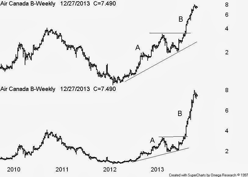
Why do you always use a semi-log scale in your charts? This is a question I always get during a teaching session. Usually the students are industry pros who surprisingly are not clear on the choice between a linear or semi-log (percent) scale.

The old rule among technical analysts used to be if the data doubles use a semi-log scale but now many will use a 50% price range before the switch from linear to semi-log. I always use a semi-log - see the Air Canada chart example.

On the lower linear scale it appears the advance at B is greater than the advance at A which is not true. The above semi log clearly displays the A & B advances to be about equal in price change. Also never draw trend lines on a linear scale. This is a common error even among CMT’s that should know better.