Saturday, December 19, 2015

Energy and December and Seasonality:


The only thing I know about seasonality is during an uptrend you buy low – sell high and then buy back even higher. In a downtrend you sell high - buy low and then sell even lower.

December more than any other month is loaded with seasonality folklore which is recycled annually in the business dailies. The books on seasonality are published every season and basically say the same thing as last season. The seasonality bible is the Stock Trader’s Almanac first published in 1967. This book allowed Mr. Hirsch to distil his lifelong interest in stock market history, cycles and patterns into a practical working tool for the average investor. It was the first compilation of the market’s seasonal trends and tendencies combined with a calendar and laid out for use by non-institutional investors.

One of the mid December seasonal plays is the “free lunch” wherein investors tend to get rid of their losing stocks near year-end for tax purposes. This often has the effect of driving the prices down to near 52-week lows. The Stock Trader's Almanac has shown that NYSE stocks selling at their lows on December 15 will usually outperform the markets through the following late January and early February. I assume the TSX would follow the same model.

Note: This year the energy complex got carpet bombed with almost panic selling – look for this group to post a big recovery advance through mid January 2016

Next is the Santa Clause rally which is a short advance within the last 6-days of December and into the first 2-days of January. The Almanac quote is “If Santa Claus should fail to call, Bears may come to Broad and Wall.”

Then we have the January Barometer which states that as January goes, so goes the year. The 2010 Almanac claims only 5 errors since 1950 for a 91% accuracy ratio.

Finally we have the January Effect which is the tendency of the small caps to out-perform the large caps through January as measured from the Russell 2000 vs. the Russell 1000 index. The Almanac post several reasons for this seasonal event.


Sunday, December 6, 2015

Gold Stocks are displaying positive divergence:


On my last post I explained divergence and the divergence setup between crude and the U.S dollar. This time I look at the divergence setup between the gold miners and the U. S. dollar.

Our chart today is the daily closes – as of last Friday - of the Market Vectors Gold Stocks ETF (GDX) plotted above the daily closes of the US dollar index as replicated by the PowerShares ETF (UUP). The technical assumption here is that the two have an inverse relationship. So, when the UUP prints a new trading high at (B) relative to the old high at (A) - we expect the GDX to print a new low at (B) relative to the old low at (A). Clearly this did not occur – note the slightly higher GDX gold miner low at (B) which is a positive divergence condition creating a bull setup signal for the GDX. Keep in mind this is a daily or short term signal and short term trend reversal studies can generate false signals.


Monday, November 30, 2015

Crude is displaying positive divergence:


Back on a blog post October 11, 2011 - I explained divergence to be a condition that occurs when two lines on a chart move in opposite directions vertically. A technician will traditionally look for divergence between a stock's direction relative to the direction of a technical study such as a price oscillator or the MACD.

Divergence can also be observed when doing inter-market studies such as gold vs. the gold stocks, a large cap index vs. a small cap index or price vs. volume. There are two kinds of divergences: positive and negative which can be also described as a bull or bear setup

Our chart today is the daily closes – last Friday - of crude (WTI) plotted above the daily closes of the US dollar index as replicated by the PowerShares ETF (UUP). The technical assumption here is that the two have an inverse relationship. So, when the UUP prints a new trading high at (B) relative to the old high at (A) - we expect the crude price to print a new low at (B) relative to the old low at (A). Clearly this did not occur – note the higher crude low at (B) which is a positive divergence condition creating a bull setup signal for WTI crude. Keep in mind this is a daily or short term signal and short term trend reversal studies can generate false signals.


Tuesday, November 24, 2015

Will that be guns or butter?


Below is a clip from the Getting Technical market letter - Interim Update November 20, 2015 GT1487

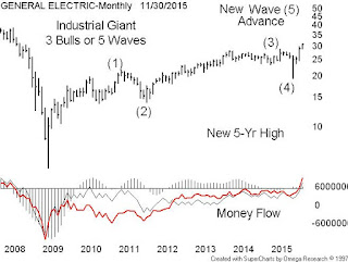
Economist Paul A.Samuelson is the founder of the modem introductory economics textbook. His textbook Economics – ISBN- 0-07-0 092863-0 has become a classic in which he states in a chapter – Central Problems Of Every Economic Society - that a nation has to choose between two options when spending its finite resources. It may buy either guns (invest in defence / military) or butter (invest in production of goods), or a combination of both.

According to Wikipedia - while president of the United States, Lyndon B. Johnson used the phrase to catch the attention of the national media while reporting on the state of national defence and the economy. Another use of the phrase was British prime minister, Margaret Thatcher's reference in a 1976 speech that, "The Soviets put guns over butter, but we put almost everything over guns.

World War II effectively ended the Great Depression of the 1930’s with the Dow Industrials rebounding from a 1942 low of 92.90 and then running up to a peak of 1000 in January 1966. The following ten years were cluttered with the noise of the Indochina War (Vietnam) and the Arab Oil Embargo.

When it relates to investing – there are two extreme possibilities:

The beneficiaries of guns over butter – Materials, Energy, Technology & Industrials

The beneficiaries of butter over guns – Financials, Consumer Discretionary & Consumer Staples & Health Care

Our chart is of General Electric (GE) a component of the NYSE listed Industrial Select Sector SPDR Fund (XLI) which is a basket of large US industrial companies.


.

Thursday, November 12, 2015

Who is buying Barrick Gold?


As of 3 pm today November 12’ 2015, I note the shares of Barrick Gold Corporation (ABX) on the TSX trading at $10.00 – up 0.32 (3.40%) on good volume of 3,725,421 shares. The December gold contact was down slightly on the day.

Barrick has been a poor sector relative performer for years – unlike the stronger names like Franco-Nevada Corporation (FNV) and Agnico Eagle Mines Limited (AEM). Our daily chart of ABX–TSX displays unusual strength

Technical analysts should not react to a reversal pattern until complete – but Barrick seems to be building an inverse head & shoulder pattern since last July along with a big volume increase.
.
I have noted the left shoulder (LS) – the head (HD) and the incomplete right shoulder (RS). That tilted line is the neck line which – when extended to the right marks the price (currently $10.40) Barrick needs to break above on volume to complete the trend reversal. The fundamental reasons for the buying are not known to me but then again the price always leads the story.


Tuesday, November 3, 2015

Who is selling Constellation Software?


I was scanning several TSX sectors for outperform through year end and decided against the iShares S&P/TSX Capped Information Technology Index ETF (XIT) which seeks to replicate the performance of the S&P/TSX Capped Information Technology Index. When you look at the top 5 components by weight – you find CGI Group (GIB.A), Constellation Software (CSU), Open Text Corp (OTC), Blackberry Ltd (BB) and DH Corp (DH).

The technical problem is Constellation Software (CSU) – which closed at $550.87 today – down $15.61 (-2.76%) on 47,000 shares - it is a thin trader. Someone has been selling CSU for several weeks now – ever since the July 24 volume spike. Our daily chart of CSU suggests caution. We can see the double tops of July 29 and Sept 2 along with a flat to declining 50-day simple moving average.

The other negative issue is the declining money flow numbers. Those thin traders all have a common problem – you have to chase the offer on the way up and you have to chase the bid on the way down

Tuesday, October 27, 2015

The Toronto MoneyShow October 30, 2015:


Join me and Kevin Prins, Director of National Sales - BMO ETFs - at the Toronto World MoneyShow Friday, October 30 at 1:30 pm as we discus ETFs and how they can be selected to use natural sector rotation as a tool to move in and out of global markets

Sector selection takes advantage of natural stock market rotation due to the normal business cycle which is led by the consumer followed by manufacturing and finally the cyclical industries. When executed properly rotation allows you to remain fully invested by over-weighting in the rising sectors and under-weighting in the falling sectors.

If you wish to adopt this strategy the first step is to recognise the 10 unique and distinct stock sectors (or asset classes) as set out by the index people at Standard & Poor's. They are Energy, Materials, Industrials, Consumer Discretionary, Consumer Staples, Health Care, Financials, Information Technology, Telecommunications Services and Utilities

The best way to understand the rotation order is to picture a 10-car roller coaster with the financial, utility and consumer sectors riding in the front two or three cars. We call this the front end of the market.  The next three or four cars will be occupied by the telecom, technology and industrial sectors. We refer to these as the middle of the market - and finally riding in the last few cars would be the energy and materials group which we refer to as the back end of the market.

Picture now this 10-car train slowly climbing to the crest of the ride (a bull market) and eventually the front end slipping over the crest and now falling. So now we have a condition with occupants in the front end screaming in fear while the middle and back end cars still are enjoying the climb. Eventually the middle cars crest and you know the rest.

The global markets also are also driven by the forces of rotation – our chart displays the lead – lag relationship between the BMO (ZUH) and the BMO (ZEO)


Saturday, October 24, 2015

The BNN - Valeant Rant:


According to Donville Kent Asset Management chief executive Jason Donville – the “Capital markets are at risk” after the Valeant attack by “some unregulated guy in Nevada”. It seems Donville and his clients along with “some poor guy in Saskatoon” were caught in last week’s Valeant torpedo-like collapse. You san see the BNN Donville - Valeant clip at http://www.bnn.ca/News/2015/10/23/Canadas-capital-markets-at-risk-after-attack-on-Valeant-warns-portfolio-manager.aspx

In the BNN clip Donville was making a valid point about some short sellers being “unregulated” and “accountable to no one” until Donville quoted “Ken of Costco” who thinks the accounting at Valeant is OK. In reality the “Ken of Costco” is Kenneth Gerard Langone Sr., an American businessman and investor best known for co-founding The Home Depot. He has an estimated net worth of $2.5 billion according to Forbes. I saw the interview on CNBC where “Ken” along with former Medtronic CEO Bill George, discusses the controversy surrounding allegation of improper accounting at Valeant Pharmaceuticals - there's a 'lot of smoke': Bill George Thursday, 22 Oct 2015 | 8:17 AM ET http://video.cnbc.com/gallery/?video=3000436853

Yes – Langone (who is likely unregulated) does say he thinks the Valeant accounting is OK – but then also says he would not invest because he does like the roll-up business model which requires bigger and bigger acquisitions to keep up the growth rate.

On the technical side – Valeant on the week of Sept 25, 2015 broke down below the 40-week (200-day) for only the third time since 2009. The price MOM peaked in April 2015 with the money flow numbers turning down in late August 2015. The current torpedo was a surprise – but then again so was the Sino-Forest fiasco.


Thursday, October 22, 2015

A look at secular bears:


The outlook looks bad for Suncor Energy Inc. (SU) with crude prices at or near 10 year lows and now a Liberal majority in Ottawa. But in reality Suncor has been a terrible investment ever since the 2009 dead cat rebound from the 2008 lows.

So much for the fundamentals

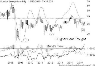
On the technical side – Suncor is beginning to print a bullish price structure. Our chart is a very long term plot – monthly bars of Suncor spanning almost ten years which happens to display Suncor’s 2008 – 2015 secular bear.

Now a bull & bear cycle count for a secular bull is about 5 cycles but sometimes extending to 7 cycles in total – or about 15 to 20+ years. Secular bears are shorter with about 3 cycles or about 8 to 12 years. On the Suncor chart we see a flat 3-cycle secular bear and rising money flow numbers from the trough of the 2nd bear to the current 3rd and final bear which should introduce a new secular bull for Suncor


Monday, October 12, 2015

The Canadian dollar effect:


Two stock charts of interest using basic technical tools – a weekly of Canadian Tire (CTC.a) with a simple 40-week moving average and money flow – a variation of on-balance-volume. The other is a monthly of Cascades (CAS) using a long term trend line and the same money flow study

On the CTC.a chart we see a broken 40-week and money flow numbers declining since October 2014 and on the CAS chart we see a mid 2013 break up above a long term trend line and rising money flow numbers. I suspect the weak Canadian dollar is the prime driver of these two bull and bear studies.


Monday, September 28, 2015

They Don’t Usually Ring a Warning Bell


On a recent post – September 3 - I presented content sent to BNN Market Call last  August 6, 2015 -

“They Don’t Usually Ring a Warning Bell: Recent investors in the crowded spaces of the health care and consumer sectors tend to be weak holders and can stampede out of a sector when alarmed by any injury to one of the sector leaders. The current and alarming drop of Apple Inc. below its 200 day moving average has the financial media buzzing and for good reason. Apple is basically a consumer related company and has only violated the 200 day only three times since mid 2003.”
.
Today our chart is a daily bar of the Concordia Health (CXR) displaying the recent downward break of the 50 and 200 day (10&40-week) moving averages. A good example of investors fleeing from an over-crowded space. Shocking – the over-loved Concordia has lost one half of is market cap in four weeks – in turn trashing the health care sector. Look for the Volkswagen fiasco to replicate the Concordia torpedo and trash the auto stocks..


Thursday, September 24, 2015

Other bellwethers in trouble:


Back in August 28 I explained the term Bellwether – which was derived from the Middle English Bellwether which refers to the practice of placing a bell around the neck of a castrated ram - (a wether) in order that this animal might lead its flock of sheep.

Question – lead to where? Green pastures or to slaughter?

At the time Goldman Sachs (GS) at about $178 had broken down below the 50 and 200 day simple moving averages. Also relevant was the break below a 26-week price channel because Goldman tends to trend within a 6-month price window.

Now we have industrial bellwethers Boeing and Caterpillar trading below their related 50 and 200 day MA’s. Our chart is the weekly bar of a Canadian bellwether – Magna International (MG) breaking below 50&200 day (10&40 week) moving averages. You can also see that Magna has zero capital returns since the Aug 2014 peak. The time to buy the auto stocks is when the US auto sales are bleak like in 2008 when US auto sales were the worst since 1992 – (MG was trading under $10) - not now when the outlook is so bright you need sunglasses.


 .

Monday, September 7, 2015

So do we buy a house or buy a bank?


The GTA real estate boom continues – according to the Toronto Real Estate Board (TREB) August publication – Market Watch and I quote,

“Sales and Average Price Up in August: TORONTO, September 4, 2015 – Toronto Real Estate Board President Mark McLean announced that Greater Toronto Area REALTORS® reported 7,998
residential transactions through the TREB MLS® System in August 2015. This result represented a 5.7 per cent increase compared to 7,568 sales reported in August 2014. On a GTA-wide basis, sales were up for all major home types.”

And, “Buyers in the GTA remain confident in their ability to purchase and pay for a home over the long term. They see ownership housing as a quality investment that has historically produced positive returns while at the same time providing owners with a place to live in their chosen community,” said Mr. McLean.”

That was quite a bullish argument for home ownership and very timely when you consider the other choice – the stock market which lately has been the target for the doom and gloom crowd   

Our chart displays the 14+yr (5190 days) monthly price of the GTA average housing price over the TSX listed iShares Financial Sector exchange traded fund (XFN) – which is a basket TSX listed financial related stocks to include the banks and insurance companies. Note the buy and hold annualized returns – GTA TREB at +6.2% and the XFN at +5.9%. So far very close but the XFN spins off income and home will attract property tax and maintenance cost.

On the other hand the XFN is more volatile and your prime residence attracts no tax on the sell side. Probably the best strategy is to diversify and own smaller portions of both.


Tuesday, September 1, 2015

We may have lost another bellwether:


As sent to BNN Market Call August 6, 2015

The Markets – Too Many Investors on One Side of the Ship

An Unstable Ship: As investors chase fewer and fewer stocks ever higher the technical analyst can see the advance / decline line and the new cumulative new 52-week HI / LOW line failing or not confirming the advance of the broad stock indices.

Thinning Leadership: During the early stages of a bull market all market sectors participate (2009-2011) in the recovery from the bear market trough of 2008. The result is a high degree of sector commonality and broad leadership. As the current bull ages – (the later stages of a bull market) – investors tend to embrace the current “big thing” which currently is the hot – health care and consumer space. The result is we currently have the Toronto and U.S. Health Care, Consumer Staples and Consumer Discretionary sectors trading at all time highs and the Toronto and U.S. Mining, Materials and Energy sectors trading at or near multi-year lows.

They Don’t Usually Ring a Warning Bell: Recent investors in the crowded spaces of the health care and consumer sectors tend to be weak holders and can stampede out of a sector when alarmed by any injury to one of the sector leaders. The current and alarming drop of Apple Inc. below its 200 day moving average has the financial media buzzing and for good reason. Apple is basically a consumer related company and has only violated the 200 day only three times since mid 2003.

The 200-day moving average rule:
A long term up trend is in place if the price is above the 200-day MA – and the 200-day is pointed upward. A long term down trend is in place if the price is below the 200-day MA – and the 200-day is pointed downward
.
Today our chart is a weekly of the SMH displaying the mid July 2015 downward break of the 200 day (40-week) moving average. The SMH bottomed November 2008 about 4-months ahead of the broader stock indices.


Friday, August 28, 2015

When lost – follow the bellwether:


The term Bellwether - is derived from the Middle English Bellwether which refers to the practice of placing a bell around the neck of a castrated ram - (a wether) in order that this animal might lead its flock of sheep.

Question – lead to where? Green pastures or to slaughter?

When applied to the capital markets – a bellwether is usually an important stock or index – for example – the Russell 2000 – Small Caps, the Dow Transports – Economy Sensitive or the Semiconductors  In the US markets an important stock bellwether is The Goldman Sachs Group Inc. (GS) because it tends to lead the US financial space which in turn is a leader in all bull and bear cycles.

Goldman posted financial crisis peaks in May 2007 and October 2007 and bottomed in October 2008 about 4-months before the broader stock indices. Subsequent to the recent sell-off - the only other major correction was the April – October correction of 2011. The best way to ID Goldman’s bull and bear cycles is to apply a 26-week price channel test – because Goldman tends to trend within a 6-month price window. Our chart is the weekly bar of Goldman displaying the April 2011 and August 2015 violations of the 26-week low (6-month) price channel. Goldman is leading so be cautions

Tuesday, August 18, 2015

The trouble with the energy stocks:


The trouble with the energy stocks is minor if you’re a well financed energy giant such as the companies in the US listed SPDR Energy ETF (XLE)  where Exxon Mobil Corp (XOM), Chevron Corp (CVX) and Schlumberger Ltd (SLB) represent about one third of the sector by market weight. Just to stress the depth of the (XLE) the number ten by weight is ConocoPhillips (COP)

In contrast the fly weight Canadian energy space – as replicated by the iShares S&P/TSX Capped Energy Index ETF (XEG) where the relatively small and troubled Encana Corporation (TSE:ECA) and Crescent Point Energy Corp (TSE:CPG) rank high in a long list of small to micro cap issuers fighting for survival.

Our chart is the monthly XLE above the XEG where you can see troubles with the Canadian energy space (XEG) beginning from the October 2011 lows when the sector failed to run to a new 2014 high as did the SPDR XLE. Note also the long 10+years bullish series of higher lows on the SPDR XLE. The long series of lower highs on the Canadian sector XEG is likely due to the flawed belief that many components can return cash to shareholders and still grow their business. Clearly the Canadian energy complex is a train wreck.

Tuesday, August 11, 2015

The rapid rise of Patient Home Monitoring:


 I see at about 12:30 today the shares of Merus Labs International Inc (TSE:MSL) at $2.58 are down 14% on about 3 million shares – about 6-times the average volume. Seems like another compelling storey has turned into a bad ending.

On the topic of compelling stories - on Friday May 8, 2015 BNN’s Andrew McCreath tweeted “$PHM Patient Home Monitoring Chairman on @BNN 'Weekly w McCreath' in 10 minutes & again at 8:30 pm tonight! #momentum”

On May 12, 2015 a follow up video - Investing Ideas - The rapid rise of Patient Home Monitoring - Part One – BNN commentator Andrew McCreath speaks with Michael Dalsin, Chairman, Patient Home Monitoring about the company's rapid growth strategy,

Also - Patient Home Monitoring (PHM.V) has been a recent stock darling for Market Call guests, appearing as a top pick eight times over the last year. The Venture-listed stock has run up more than 550 percent in the last 12 months alone, based on its growth by acquisition model, as the in-home health care provider acquired nine companies over an 18-month span.

“The wave is finally here. Ten thousand people a day turn 65-years-old and the market is ripe and there’s a lot of demand,” Michael Dalsin, chairman of Patient Home Monitoring told BNN’s Andrew McCreath.

Many investors, however, approach this ‘roll-up’ strategy with scepticism. BNN’s Frances Horodelski says one risk associated with this strategy can be found in accounting. “Acquisition accounting can mask true underlying, organic growth,” she said. “Things can get messy with leverage, non-cash items, balance sheet adjustments, tax policy changes, a host of things that require a deep analysis to uncover.”

Now the technical analyst will usually focus not on the news – but how a stock will react to the news. In other words if the news is negative and the stock goes up. that is bullish – and if the news is positive and the stock goes down, that is bearish. Stocks trade at not what the news is – they trade on what the news will be in the future. So the bullish Dalsin – McCreath interview took place on Friday May 8, 2015 after the close of trading. Now a bullish investor may anticipate a big up day the following Monday May 11 – but no – the stock closed at $1.51 down on the day  A PHM chart tells all.


Friday, July 24, 2015

More Gold and Fibonacci Retracements:


Last week I displayed a chart - monthly of gold setting out the advance from financial crisis low – of about $700 to the 2011 price peak of about $1900 – then down to the current lows of about $1160 which worked out to be a Fibonacci retracement number of about 62%.

Fibonacci Retracements are ratios used to identify potential reversal levels. The most popular Fibonacci Retracements are 61.8% and 38.2%. Note that 38.2% is often rounded to 38% and 61.8 is rounded to 62%. While 50% was not a Fibonacci number it is a very important technical correction price target.

Today’s gold chart is a monthly of gold setting out the advance from the bear market lows of 1999 through 2001 – of about $250 to the 2011 price peak of about $1900 – then down to the current lows of about $1080 which generates a current retracement number of about 50%. A failure here could take gold down to $895 for a retracement of 62%. Look for the gold miners to confirm when the bottom is in.


Thursday, July 9, 2015

Gold and Fibonacci Retracements:


I was a guest on BNN’s Market Call on Monday and I have to apologize to a BNN caller who asked about gold and a Fibonacci Retracement. I skated around the answer because – without a chart I just stated that 50% was not a Fibonacci number. Fibonacci Retracements are ratios used to identify potential reversal levels. The most popular Fibonacci Retracements are 61.8% and 38.2%. Note that 38.2% is often rounded to 38% and 61.8 is rounded to 62%

Our chart is a monthly of gold setting out the advance from financial crisis low – of about $700 to the 2011 price peak of about $1900 – then down to the current lows of about $1160. The current retracement number is about 62%.

Most interesting is a look at the TSX most actives at the close July 8 – out of a total of 100 most actives only about 15 issues were up on the day – 10 being gold stocks – some symbols, ABX, BTO, LSG, NGD. G, K, ELD, AFM and AR. I just took a call form Fibonacci who thinks now is the time to bottom fish.

Tuesday, June 23, 2015

The Golden Cross Myth:


I happened upon an entertaining item – The Globe And Mail Wednesday June 17, 2015 Jennifer Dowty – CAN STANTEC’S ‘GOLDEN CROSS’ LEAD TO MORE GAINS? Dowty who is a CFA takes the time to explain the technical term “Golden Cross” to us less informed readers. Downty quotes from some unnamed source;

Definition: A ‘Golden Cross’ is a bullish technical indicator for a stock. It occurs when the stock’s 50-day moving average crosses above the 200-day moving average. When a Golden Cross occurs, it indicates that the short term price trend is rising.

So here is the problem – Dowty is just blowing smoke because the so-called Golden Cross is just another urban myth which has been promoted by the business media.I remind Dowty that CFA means Chartered Financial Analyst – not Charting Financial Analyst.

Any technical analyst who has back tested and/or traded on the Golden Cross knows – it generates a 50 per cent outcome – at best. That is because the 50 and 200 day crossover occurs about half-way through the price move. A back test on Stantec from November 2005 to date issued 7 signals with 3 winning trades and 4 losing trades. A back test on Suncor over the same period = 8 total signals with 4 winning trades and 4 losing trades. BlackBerry over the same period = 5 total signals with all five losing trades.

Our chart – daily of Stantac and the Golden Cross clearly displaying the late signals..


Tuesday, June 16, 2015

Apple and the New Dow Component Jinx:


I see Apple Inc as built a triple top on a point & figure chart. I love P&F charts because most of the squiggly line guys never use them.

Apple Inc was added to the DJII March 2015 suggesting that Apple is in transition from a growth stock to a value stock. In other words – the great 2001 – 2015 growth period may be over. Some past DJII growth to value stocks - Cisco Systems added in June 2009. Bank of America and Chevron added in February 2008, Intel and Microsoft were added in November 1999

Honeywell was dropped from the Dow in February 2008 and has doubled in price – now a true growth winner – Alcoa also doubled in price after being dropped in September 2013

Our chart – monthly of Apple Inc displays the progressively shorter growth periods – this may cause some momentum loss in the broader technology sector

.

Wednesday, June 10, 2015

Falling bonds and urban myths:


I note the iShares Barclays 20+ Yr Treas.Bond ETF (TLT) at $115.73 is down about 20 per cent from the January 2015 price peak of $138.50 and the yield on the 10-yr T-Note has jumped from 1.65% to 2.47%. Remember rising bond yields mean falling bond prices – and that according to an urban myth – is bad for stocks.

Q: So how come over the same time period the S&P500 is up about 3 per cent?

A: The equity market is telling us that interest rates are rising because the global economy is improving – and we are past the deflation fear.

To repeat – I think we have the Sell-of-a-Generation on bonds – the last time this happened was back in late 1941 – the stock market bottomed a few months later and ran non-stop through to the mid 1960’s. A look at the NYSE new 52-week high list at the close June 5, 2015 displayed about 60 names – over half being components of the financial sector and we all know that the financial sector always leads bull and bear cycles
.
Our chart – displays a bullish message two financial ETFs – the SPDR (KRE) Regional  Banking sector and the TSX listed BMO equal weight US bank ETF (ZUB) – both printing new 52-week highs. Note both are still trading above a rising 50-day MA – so I still don’t think we sell in May and run away.


Thursday, June 4, 2015

What will it be – profits or ethics?


These are direct lines from the 1995 movie - Casino

Ace Rothstein: [narrating] The town will never be the same. After the Tangiers, the big corporations took it all over. Today it looks like Disneyland. And while the kids play cardboard pirates, Mommy and Daddy drop the house payments and Junior's college money on the poker slots.

Ace Rothstein: [voice-over] In the casino, the cardinal rule is to keep them playing and to keep them coming back. The longer they play, the more they lose, and in the end, we get it all.

Well as investors we have choices – we could buy “sin stocks” such as the booze and tobacco stocks or we could own the shares of casino stocks such as Caesars (CZR), Las Vegas Sands (LVS) or Wynn Resorts (WYNN) and so on – but most of them have been losers – probably because they have high cost physical locations.

The on-line gaming stocks get around the physical location problem – all the customer needs is a smart phone and a credit card. On example among the many TSX listed gaming stocks is Amaya Inc. who on June 1 , 2015 confirmed that its top two executives are named in an investigation by Quebec’s security regulators relating to trading activity of the company’s stock ahead of the $4.9 billion PokerStars takeover in June 2014.

Seems appropriate to quote source stockchase.com on analyst Benj Gallander - BNN’s Market Call March 26, 2015 “When you deal with the gaming sector, there are some people that can be less savory than others”

To me the acid test is to decide if the customers of an enterprise enjoy a benefit from the product or service of said enterprise. Do the most buyers of Ford offerings enjoy a benefit? Do most customers of Scotia Bank services enjoy a benefit? Do most travelers using Air Canada enjoy a benefit? You know what I mean.

So as an investor ask yourself – do most “users” of on-line gaming platforms enjoy a benefit? Personally I think not – so as a potential investor – I am out.