Thursday, April 28, 2011

The Next Big Thing

The next big thing is a key “must know” for long term investors who wish to make above average market returns without excessive trading in and out of volatile stocks. The next big thing is a pending dominant theme that can persist for at least 10 years. The dominant theme will drive the beneficiaries upward to all time highs and for the most part will have long bull cycles interrupted by short flat bear cycles.

Some past dominant themes were the Nifty Fifty of the 1950’s and 1960’s. The mid to late 1970’s introduced the modern economy or first technology boom of the English speaking countries. The mid 1980’s introduced a parallel boom in the financial services sector – so for twenty years from 1980 to 2000 all you had to do was to own technology and bank stocks. Some past false booms were infrastructure and alternate energy.

Our chart is about 15-years of the technology weighted Nasdaq Composite that clearly displays the first technology bubble that was confined within the English speaking countries. The 2000 – 2010 period is a 3-cycle secular bear which is now almost completed. Yesterday the Nasdaq jumped to a 10-year high as U.S. stocks rallied on Wednesday after Fed Chairman Ben Bernanke's first-ever press conference. This is significant technically because a second “echo” or global technology is now just getting underway in the emerging markets. The Nasdaq is our new dominant theme.

Monday, April 25, 2011

Apple Inc. Who made the most money?

I can always spot a novice technical analyst when I look at a few of their charts. Some common errors are the use of incorrect scaling, the excessive use of squiggly lines, the excessive use of daily charts, the reliance on free internet charts from Big Charts or Stockcharts and the inability to spot divergence.

The scaling error is the easy error to spot so here is the rule: If the data in the window doubles use a semi-log scale. I do note the Market Technicians Association (MTA) recommend switching to a semi-log scale if the data exceeds 30% of the price range.

There are two big problems associated with the use of a linear scale in long term technical analysis. First is you cannot properly place trend lines on a linear scale chart and second, in a long advance it appears most of the gains are recent. In other words the newer investors are making more money that the older investors. This creates a false sense of urgency to jump in now because the advance appears youthful.

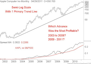
Note our first chart of Apple Inc., monthly data spanning about 10-years using a linear scale. I have placed two primary trend lines that split the two great advances of 2004 to 2008 and then from 2009 to date. So which advance made the most money?

Note our second chart of Apple Inc., monthly data spanning about 10-years using a semi-log or percent scale. I am now able to properly fit one primary trend line that still splits the two great advances of 2004 to 2008 and then from 2009 to date. So which advance made the most money?


Monday, April 18, 2011

The Advance Decline Line

According the Market Technicians Association - the Cumulative Daily Advance-Decline Line, perhaps the most widely known market breadth indicator, traditionally has been used to spot divergences relative to a general market price index, such as the S&P 500 or Dow Jones Industrial Average. Most commonly, the Cumulative A-D Line is calculated as a running total of daily net advancing minus declining stock issues on the New York Stock Exchange. Similar indicators may be calculated for other markets, such as NASDAQ, and weekly data also may be used. There are only two steps to compute this indicator.
1. From the number of advancing issues, subtract to number of declining issues each day, respecting sign. This is net advancing issues, and it is often a negative number.

2. Add that daily advance-declines difference to a cumulative total of the daily net advancing issues. This forms a continuous line that rises and falls with breadth trends on the NYSE.

The late great Ian Notley used a slightly improved formula which takes into account the number of unchanged issues or (advancing –declining)/unchanged. Either way the best way to read the A/D line is to spot divergences – such as the current divergence between the S&P500 and the NYSE A/D line. In order to correct the current negative divergence condition we need both the S&P500 and the A/D line to push back above their February – March peaks as noted on the chart. We should respect this indicator as it called the March 2009 bottom and the July 2010 bottom

Tuesday, April 12, 2011

The Rebound Bull

For those who missed my April 1, 2011 BNN rant describing the structure of the current global bull market in equities to be that of a rebound bull.

“A rebound bull is a bull market of short duration and great magnitude that typically follows a granddaddy bear market. The granddaddy bear is introduced by a crisis and is usually of long duration and great downside magnitude. There is no defense against the Granddaddy bear because like a financial tsunami, all stock asset classes swept away at the same time. There have only been three granddaddy bears over the past 40 years – the 1973-1974 Arab Oil embargo. The 1987 change in U.S. Fed policy bear and the 2007-2008 liquidity crisis. The bear of 2000-2002 was not a granddaddy but rather a sector crash (technology) with other sectors – financial and energy being unaffected.

The rebound bulls that followed each of the granddaddy bears were all similar in that they were short – no more that 24 months and they had great price magnitude, usually in the order of at least a two thirds retracement of the granddaddy bear. Rebound bulls are usually followed by a flat cooling off period – like a flat mini-bear if you will and when the cooling period ends the markets move on to new 52-week highs.

The best way to deal with the current mature rebound bull is to seek out stock sectors like the TSX Financial that are just emerging from the “cooling off” period.”

Note: The only other sector with similar structure is TSX Technology

Tuesday, April 5, 2011

Gold Bugs and Gold

In a previous post I detailed the very long term relationship between the gold miners and the price of bullion which has not been one of perfect price correlation. During the early stages of gold’s secular advance (2000 through 2003) the gold miners outperformed the price of bullion. In the mid stages of the secular advance (2004 through 2008) the price of bullion outperformed the gold miners. This relationship was displayed on a very long term monthly chart

As we enter the mature stages of gold’s secular advance and there is growing technical evidence via shorter term spreads that the gold miners will once again return to out perform. This is displayed in more detail on a weekly chart where I have placed a relative average spread along with the weekly stock cycle. Note the bullish cyclic commonality of the intermediate cycle troughs in the stocks and the metal.

It appears a bullish stampede into the gold miners is just getting underway which is typical of a late cycle blow off. Enjoy the party but don’t over stay your welcome.