Thursday, December 22, 2011

Tax Loss Selling in Bear Market Years

This strategy is particularly intense during the during bear market years as investors and portfolio managers lock in capital losses for the current trading year. A portfolio manager will engage in tax loss selling to ensure the overall portfolio does not attract a taxable gain in the event of a small per cent of profitable positions.

Important Dates for 2011

Canadian exchanges are closed Dec 26 & 27, 2011.  In order to have a sale transaction settle within the 2011 calendar year in Canada, sell orders must be filled on Dec 23rd 2011 for Canadian exchanges. The NYSE is open on the 27th which would be last day for selling in order to settle on Dec 30th.

Any issuer sold cannot be bought back within 30 days, or it will not count as a capital loss. Consider buying a similar investment if you wish to retain exposure to the related sector such as metals, energy or the financials. As an example, if you sold Kinross Gold Corp at a loss you could buy IAMGOLD Corp on the same day. You would be trading a distressed gold stock for another distressed gold stock. If you had a basket of gold stocks to sell you could buy a gold stock related ETF such as the iShares S&P/TSX Global Gold Index Fund (XGD)  

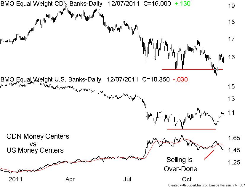
IMPORANT: This group has historically printed a significant rally in the first week of the following January. The basket below could produce a one-week return of 15% 

Tax Loss Selling Rebound Candidates      14-Dec11

Stocks under $1 and a volume of less than 30,000 are removed


Company                     Symbol Price                Volume

Friday, December 16, 2011

Gold do we hold or fold?

On my last post I told the gold bulls to cheer up because the worst may be over because the generally bullish Dennis Gartman said he expects the yellow metal to fall to $1,450 an ounce before it breaches $1,800 and Gartman has fully closed his gold position. Since Dec 12 gold has dropped from 1666 to 1575 and so we need to take a look at the technical picture.

Our chart today is the daily closes of the NYMEX gold plotted above the AMEX Gold Bugs Index. So far this looks like a simple A-B-C type correction in both plots. Currently there is a small degree of bullish positive divergence with the AMEX Gold Bugs printing a higher corrective wave low (C) relative to corrective wave low (A). We need these lows to hold in order to avoid a (C) wave extension. When you look at a very long term weekly or monthly gold chart the primary up trend line has not been violated.  

Tuesday, December 13, 2011

The Gartman Track Record

Gold bulls cheer up, the worst may be over. I just found this on Forbes.com 12/12/2011 @ 2:00PM. “Gold prices continue to tumble in the face of a stronger dollar, prompting the generally bullish Dennis Gartman to say he expects the yellow metal to fall to $1,450 an ounce before it breaches $1,800.  Gartman has fully closed his gold position.”

According to Horizons Exchange Traded Funds. The Horizons Gartman ETF (TSX-HAG) gives investors direct exposure to the investment strategies of The Gartman Letter. They go on to say Dennis Gartman likely doesn’t need any introductions. Author of The Gartman Letter a highly regarded daily macro-economic and trading-oriented newsletter which is read by the investment community including leading global banks, brokerage firms, hedge funds, mutual funds and commodity trading companies

Gartman is a perfect contrarian indicator - look at his “real money” track record. From inception March 26, 2009 (that is when the global equity markets bottomed) the HAG is down 23% or negative 9.21% annualized. The bid at the close Dec 12, 2011 @ $7.65 would be another new 52-week low.

Our chart today is the daily closes of the HAG plotted above the TSX60 Index. The relative perform vs. the TSX60 is “disturbing”. Note the position of the 10 & 30 week MA with the 10 week for the most part below the 30 week MA over a 140 week period. That is a down trend. Go figure.

Thursday, December 8, 2011

Is it a Bull or a Bear?

The big technical question right now is; are we in the early stages of a new bull market or are we about to print another leg down in the global bear that has operating since April 2011?

As technicians we need to know the dominant North American sectors – in the U.S. they are financials, technology and the industrials. In Canada the dominant sectors are financials, energy and materials. Note one common sector, the financials. This should be of no surprise because there has been no modern bull market that has operated without participation or leadership of the financials. If you know of one, let me know

Our chart today is the daily closes of the CDN bank sector plotted above the U.S. bank sector. Note that our healthier CDN banks briefly traded below their Sept-Oct lows while the “riskier” U.S. money center banks did not confirm the CDN bank breakdown. I blame the selling in the CDN banks on those young and inexperienced portfolio managers who watch too much business television. I believe we are in the early stages of a great new bull market and our CDN banks are a buy at these levels. If I am wrong I will convert to the temple of noted bear and economist David Rosenberg.

Tuesday, December 6, 2011

Canadian Securities Institute Item Jan 2006

Good educational value - this is a clip - Technical analysis is the best way to determine the trend. The most common tools are trend lines and moving averages.

Some time ago I adopted a modified version of the "True Range" to determine the trend because the same system can also be used to set trailing stop loss settings.The original True Range was described in 40 year old publication by J. Welles Wilder Jr. entitled New Concept in Technical Trading Systems, When the True Range bands are applied to Tembec Inc. we can easily see the trend 

When the True Range bands are applied to Sino Forest Inc. we can easily see the trend


The technical rule is simple; do not buy anything in a down trend no matter what anybody says - period.

The formula:

The true range is: the absolute value of the largest of the following – (I use weekly data) 

·         Distance between today’s high and today’s low

·         Distance between today’s high and yesterday's close

·         Distance between today’s low and yesterday’s close

Once you have the true range, you then calculate the upper and lower bands.

The upper band is the trading HIGH plus the TRUE RANGE. (10 period smoothing)

The lower band is the trading LOW minus the TRUE RANGE. (10 period smoothing)

Bill Carrigan

Wednesday, November 30, 2011

Last BNN Sept 30, 2011

This is the text word for word setup for Market Call appearance September 29, 2011

TO: BNN – "Franklin Cameron"
From: Bill Carrigan
RE Market Call Sept 30, 2011

Current activities:

Editor of the Getting Technical Market letter (and)
Business columnist Toronto Star
A sub-advisor to Stonebrooke Asset Management Ltd and Union Securities

Top Picks for September 30, 2011

Over sold assets to out perform through year -end

BMO Equal Weight US Banks Hedged to CAD Index ETF (ZUB) @ $10.00 – a TSX listed ETF that gives you exposure to the large beaten up U.S. banks

BMO Nasdaq 100 Equity Hedged To CAD Index ETF (ZQQ) @ $17.27 a TSX listed ETF that gives you exposure to the important U.S. technology sector

iShares S&P/TSX Capped Energy Index Fund (XEG) @ $15.40 a TSX listed ETF that gives you exposure to the beaten up CDN energy producers and oilfield service co’s

Disclosure:

Direct ownership of ZUB

Indirect - Client /firm (Union portfolios) have direct ownership of All selections

The Markets:

I recall Warren Buffet saying during a televised interview, "If you wait for the robins, spring will be over." Mr. Buffet was referring to the relationship between stock prices and the economy. Buffet believes the stock market will move higher well before either the sentiment or the economy turns up.

This relationship is being tested once again as fears of a new recession are putting pressure on the stock markets which in spite of a recent rally are struggling to remain above the year-to-date lows posted last August.

The opinion among many experts is always mixed at these important junctures because during periods of confusion and panic traditional forms of fundamental and technical analysis fail to work. Stock valuations are trashed, moving averages and trend lines are broken and safe havens such as the U.S. dollar and U.S. T-bonds with negative returns are nonsensical.

What I look for technically during difficult times like this is divergence.

Currently there is positive divergence between the Dow Industrials and the Dow Transports see CHART (1)

There is also internal positive divergence in the DOW 30 and the TSX60 components with more components now higher now than back at the last August lows. CHART (2)


Chart #1


Positive diverge and DOW THEORY – the averages must confirm


Chart #2 the DOW Industrials Internal Strength


HD is one of 22 components well above the August low


Fibonacci retracements of the 2009 – 2011 Bull are text book


Monday, November 21, 2011

We are Technically OK

Here I am on Monday November 21 about 1pm and the Dow is down 296 and the TSX Comp is down 185. Panic now as investors sell to raise cash. Business television as usual is loaded with doom and gloom.

Technically we are still OK. The NYSE advance / decline line at mid-day is still holding above the early September peak and the A/D line is also well above those early August – late September lows. For more bullish evidence look at the iShares Dow Jones US Regional Banks (IAT) $19.94 which seeks investment results that correspond generally to the price and yield performance of the Dow Jones U.S. Select Regional Banks Index

Top 5-holdings by weight

U.S. Bancorp Common Stock                        USB
PNC Financial Services Group                      PNC
BB&T Corporation Common Stock               BBT
Fifth Third Bancorp                                         FITB
SunTrust Banks, Inc                                       STI

The regional banks lead the SPDR Financial and so far there is no technical damage. Note the recent breakout on the relative spread. As of to-day the IAT at $19.35 is just down to support at the 50-day MA – now or never.

Friday, November 11, 2011

Dominant Theme Investing

To identify and ride a dominant theme is the best way to generate above average returns for at least a 10-yr home run. In the mid 1980’s we had the likes of Walmart, Microsoft and Intel all 1000% winners. In the mid 1990’s the financial and energy stocks began to run and in 2003 the commodity sector took off.

Not all dominant themes pan out such as infrastructure and alternate energy

A new dominant theme is now just getting underway – an “echo” or global technology boom. The first tech boom ran from 1985 to the bust of 2000 and was confined to the English speaking counties. The new global tech boom will be enjoyed by the survivors of the first tech boom and bust.

Technically after a bubble a long congestive secular period will follow in order to repair the damage. Usually there are three bull and bear cycles that span a total of about 12+ years – much like the 1968 – 1980 secular down period. The fourth cycle is usually the breakout cycle. Watch for Cisco Systems to finally break out and up from here – note the new 4th cycle

Sunday, November 6, 2011

A Levered Barrick Play

The Horizons BetaPro S&P/TSX Global Gold Bull+ ETF (HGU) and the Horizons BetaPro S&P/TSX Global Gold Bear+ ETF (HBP Gold Bear+ ETF) seek daily investment results equal to 200% the daily performance, or inverse daily performance, of the S&P/TSX Global Gold Index. The Index consists of securities of global gold sector issuers listed on the TSX, NYSE, NASDAQ and AMEX

This product is highly correlated now with heavy weight Barrick Gold and is basically a levered call on Barrick. OK if you like ABX like I do manly because of the recent higher low put in following 9-months of bullish price congestion the HGU at $16.52 is a lower cost way to participate in Barrick.Gold – think of the HGU as a call option with no expiry

Wednesday, November 2, 2011

On Selling RIM and owning ABX

A few posts ago I observed that Research In Motion at $23 was almost a joke – unless the market knew something we don’t know - but I don’t think RIM is going bust anytime soon. The technical view of RIM is one of the worst big cap train wrecks I have ever seen. RIM was so bad it had to be good. So here we are with RIM at another 52-week low. I planned to sell on a weekly close below the August 8 low of $21.40 and so I now am done with RIM.

The big cap gold stocks are not only lagging the bullion they have not yet attracted the investment sheep. They are raking in the cash and are retuning some to shareholders. Technically on the TSX Gold index there is much price congestion through 2011 but the relative perform vs. the TSX60 is bullish. The price is above the 40-week MA and we have a rising primary trend line. A move above the 420 level should attract some sideline cash. Enjoy with ABX or the basket iShares S&P/TSX Global Gold Index Fund (XGD).

Monday, October 24, 2011

Stop Watching Television!

Some business television programming could cause damage to your investing strategy. To-night I caught a portion of Howard Green’s Headline, and I was mortified by the doom and gloom vacant content. His guests were Dumb & Dumber (I think they go by Randy and Brian). These two wouldn’t recognise a bull market if it bit them on the ass. What babbling – Greece this, the Euro Zone that, the U.S. credit down grade, please! All this has no relevance to investing.

Almost every stock component in the Dow Industrials is a beneficiary of the global growth story. China grows a new Greece every year. A recent CNBC commercial has this wise tip, “opportunities don’t come gift wrapped, they come in storms.” Did you profit from the storms of 1973-1974, 1986, 1998, 2000-2002, 2008 and last summer?

Enough fundamentals, our chart today is the daily closes of the Dow Jones Industrials plotted above the daily closes of the Nasdaq Composite spanning that nasty May – August mini-bear. Note the highest recovery peaks that followed the August lows. Now look at to-days close – clearly above their prior highs. Higher highs mean advances. Just for more technical support look at the S&P500, Dow Transports and most of the SPDR sectors – all except SPDR Materials above the prior rally peaks. For more technical evidence take a look at CNR and UNP – both back above the 200 day MA.

Tuesday, October 11, 2011

A word on divergence:

A few posts ago I described the sudden and sharp decline in the Dow from the late July price peak through to early August to be a final Elliott “C” down wave. At this time investor temperament changed from bullish to bearish causing investors to stampede out of risky assets and into safe assets. Now after a late August advance and a September swoon, we found most of the major North American stock indices once again sitting at or just below their relative early August lows. The question was; do we hold, or do we fold?

What I look for technically during difficult times like this is divergence.

Divergence is a condition that occurs when two lines on a chart move in opposite directions vertically. A technician will traditionally look for divergence between a stock's direction relative to the direction of a technical study such as an oscillator or the MACD.
Divergence can also be observed when doing inter-market studies such as gold vs. the gold stocks, a large cap index vs. a small cap index or price vs. volume. There are two kinds of divergences: positive and negative which can be also described as a bull or bear setup.

Our chart today is the daily closes of the Dow Jones Industrials plotted above the daily closes of the US 10-yr T-Bonds spanning about 5-months. In this example I am comparing the Dow to investor fear as illustrated by the flight into U.S. Treasuries. Note the recent prices relative to their August lows. Last September 22, the 10-yr yield closed below the August 8 low and Dow Industrials closed above the August 8 low. This price divergence has created a bull setup because while investor fear was greater (lower bond yields) the Dow price was higher. This is bullish divergence.

Friday, September 23, 2011

Saved by the DOW

First the bad news: The big technical test is for the August 8 lows to hold – see the inter-day DOW chart below. The August 8 low is Dow 10604 and so at 10680 we are at the tipping point. Can we recover from here? See the breadth observation below
Now the good news – so far The Dow internals (breadth) are today in better shape than back in August 8 At quick look at the Dow 30 components and counting how many are above or below their relative August 8 lows As of 2.50 pm September 22, 2011 – I count only 8 (eight) components trading under their relative August 8 lows. The symbols: AA, BAC, CAT, DD, HPQ, JPM, MMM and TRV - Total 8 - All the rest, a total of 22 (twenty two) components are above their respective August 8 lows


Wednesday, September 21, 2011

On Selling RIM

A few posts ago I mused that Research In Motion at $23 was almost a joke – unless the market knew something we don’t know - but I don’t think RIM is going bust anytime soon. The technical view of RIM is one of the worst big cap train wrecks I have ever seen. RIM was so bad it had to be good

A few weeks later there was some technical good news on RIM based on a relative perform analysis on RIM vs. AAPL. In August RIM popped from $22 to over $32 then suddenly the torpedo and now right back to $22. Clearly the trade is not working and so I have three choices - sell, hold or add on to the position

Adding on is out because we never add to a losing position unless we planed the original buy in tranches. I won't sell yet just in case we are forming a double bottom. Note the slightly higher money flow lines. I will however sell on a weekly close below the August 8 low of $21.40 - see the daily RIM chart with the stop support line.

Tuesday, September 6, 2011

The August 8 Lows are Still Holding

The TSX Composite is still trading above support at the 11900 to 12000 level - see the weekly chart below. - Currently the simple 10-week moving average is too far below the simple 40-week moving average where these extreme deviations usually signal an over-sold condition or a pending reversal. Also the very slow stochastic has printed a trough at the over-sold 20 per cent level. The August 8 low is 11618 and should hold so don’t be a seller here  

The Dow Industrials are still trading above support at the 10700 to 10900 level - see weekly chart below - Currently the 10 week MA has been below the 40 week moving average for 6-weeks and is setting up an over-sold condition or a pending reversal. We last saw this condition during the 2010 June – July correction. The very slow stochastic has printed a trough at the over-sold 20 per cent level. The August 8 low is 10589 and should hold so don’t be a seller here 


Friday, August 26, 2011

Glad I Bought RIM

A few posts ago I mused that Research In Motion at $23 was almost a joke – unless the market knows something we don’t know - but I don’t think RIM is going bust anytime soon. The technical view of RIM is one of the worst big cap train wrecks I have ever seen. The weekly displayed the MACD falling with no divergence in sight, the 10-week price channel has been falling for 19-weeks, the 10-week ROC has been negative for 20 weeks and the per cent divergence (CP#) from the 30-week MA is at a historical record of negative 50 per cent. RIM was so bad it has to be good

Now a few weeks later I see some technical good news on RIM based on a relative perform analysis on RIM vs. AAPL. The break down in RIM began last March 2011 when RIM slipped below $65 and began to under perform its rival Apple Inc. Note the series of under perform numbers through to early August. Now we can see the early up turn in RIM vs. AAPL and so I will stay with the position until the relative turns against me. Keep in mind that what is good for RIM is also good for the iShares Info Tech exchange traded fund (TSX-XIT)

Sunday, August 14, 2011

Elliott Wave Basic Tenents

The nasty selling panic that began three weeks ago has confused the fundamental and technical analysts. The fundamental guys fear a recession along with declining earnings and those risky European banks. The technical guys study the MACD, the RSI, stochastics and moving averages. The only thing that works is Elliott Wave because when the count is applied to long term charts we can see where we were and where we are going.

Our first chart is the basic 8-wave count of a full bull and bear Elliott Wave count. Note the bull phase – impulse wave to (1) which is followed by a counter trend corrective wave down to (2). We then get an impulse wave to (3) which is followed by a counter trend corrective wave down to (4). We then get the final advance to (5) which is then followed by an A-B-C or three wave correction or bear phase.

Some basic tenents are the corrective (2) will never violate the low of impulse wave (1). Impulse wave (3) is never the shortest wave and the low of corrective wave (4) will never enter the space of impulse wave (1). The theory of alternation holds that if corrective wave (2) is short and simple than corrective wave (4) will be long and complicated. So there you have it as set out in our simple diagram

Now I am illustrating an Elliott Wave count on the Dow Industrials using weekly data to set out the 2009 to date 1-2-3-4-5 bull advance count and the subsequent A-B-C correction or bear phase. Note the last C wave corrective wave has been a sudden and sharp decline accompanied by fear, confusion and panic which is typical of a C wave bottom. If this is a bottom then we start into a new Elliott Wave 1-2-3-4-5 wave advance that should run through 2013. Keep in mind that a new impulse was (1) is always thought to be a bear market rally


Thursday, August 4, 2011

I Bought RIM Today

The current liquidation of equities is a global event which I will address on the weekend but today’s broad collapse has to deliver some opportunity. Now Research In Motion at $23 is almost a joke – unless the market knows something we don’t know - but I don’t think RIM is going bust anytime soon.

The technical view of RIM is one of the worst big cap train wrecks I have ever seen. The weekly displays the MACD falling with no divergence in sight, the 10-week price channel has been falling for 19-weeks, the 10-week ROC has been negative for 20 weeks and the per cent divergence (CP#) from the 30-week MA is at a historical record of negative 50 per cent. RIM is so bad it has to be good

Friday, July 22, 2011

Listen to the markets

Forget all that noise centering on the euro-zone debt problems and the possibility of U.S. lawmakers failing to reach a debt ceiling deal by August 2, 2011.

Take a look at some of the biggest $ gainers today - Calfrac Well Services Ltd. (CFW) up $1.36 (+3.7%), Precision Drilling Corporation (PD) up $1.11 (+7.2%), Trican Well Service Ltd. (TCW) up $0.97 (+3.9%) and Total Energy Services Inc. (TOT) up $0.90 (+5.9%). Take a look at the recent new 52-week highs and you find the same names.

Now I am a bellwether guy in that I look for the behaviour of the sector leaders before acting on the sector as a group. When I see the oilfield services stocks on the move I have confidence the broader energy stocks – the oil & gas producers and the integrated big guys will follow. Now I know gold is the hot sector right now – but don’t overlook the energy sector. Our weekly chart displays some of the leaders – all just getting underway so there is still time to do some homework on the sector

Tuesday, July 12, 2011

Technical Non-Event

This is a clip from yesterday’s Globe Report on Business, “North American stocks suffered their deepest losses in more than a month Monday, as investors fled from risk amid deepening worries about the spread of European debt contagion, the U.S.'s own debt problems and the looming corporate earnings season.”

The S&P/TSX composite index closed down 191.95 points, or 1.4 per cent, the Dow Jones industrial average lost 151.44 points or 1.2 per cent and the Nasdaq composite index slumped 57.19 points or 2 per cent. It was a gloomy day.

The markets were been hoping the Greek crisis could be limited to Greece and a few other smaller Euro area nations such as Ireland and Portugal. But the sudden rise in concern about Italy raises the spectre of a much broader and harder-hitting debt crisis.
Pile on the uncertainty is the continuing impasses in Washington over the U.S. debt ceiling and the result is the fear of risky assets.

Now the problem technically is there is no problem. Our chart today is the Dow Industrials (daily) plotted above the Dow Transports (daily) along with the industry standard 50 and 200 day simple moving averages. Note in each plot the shorter 50 DMA is above the longer 200 DMA. Note also the price of the industrials and the transports is still above the 50 DMA. The nasty two day sell-off is a technical non-event so ignore those perma-bears who wish to scare you out of equities

Thursday, June 30, 2011

Cyclic Commonality

There are five cycle principles - Summation – Commonality – Variation – Nominality and Proportionality. Commonality is rare, much like a lunar eclipse. The condition is setup when the cycles of the major stock sectors bunch together following periods of congestion or non-correlated splaying. In other words when the peaks and troughs of cyclic rhythms and the relative magnitudes are similar when over-laid in graphic form - we have a significant buy or sell opportunity

The innovators of this graphic placement of the intermediate cycles were the great Ian Notley and Don Stark back in the early (1982) Dominion Securities Trend & Cycle days.

Our weekly chart is displaying a pending rare cycle commonality trough in the top five weighted TSX sectors – financial, energy, materials, industrials and energy. The summation of these troughs and peaks precedes a major move – this is only the second time in the last 5-years we have had a pending significant trough – this is a setup for a pending powerful advance through the summer months - possibly the most significant advance opportunity of 2011!

Sunday, June 19, 2011

NYSE A/D Line & Positive Divergence

A Google search on NYSE Advance Decline Line will serve up many offerings and so I selected http://stockcharts.com/school/doku.php?id=chart_school and this is a clip

“The Advance Decline Line (AD Line) is a breadth indicator based on Net Advances, which is the number of advancing stocks less the number of declining stocks. Net Advances is positive when advances exceed declines and negative when declines exceed advances. The AD Line is a cumulative measure of Net Advances. It rises when Net Advances is positive and falls when Net Advances is negative. Typically, the advance-decline statistics come from the NYSE or Nasdaq on a daily basis. Chartists can plot the AD Line for the index and compare it to the performance of the actual index. The AD Line should confirm an advance or a decline with similar movements. Bullish or bearish divergences in the AD Line signal a change in participation that could foreshadow a reversal.”

Note the key word here DIVERGENCES. A divergence occurs when two lines on a chart move in opposite directions vertically. The lines can be two indices (the DOW and the Russell2000) or, an index and a technical study such as a stochastic or for our purpose the NYSE advance/decline line. A positive divergence occurs when the indicator moves higher while the stock is declining. A negative divergence occurs when the indicator moves lower while the stock is rising.  
Our Current NYSE A/D line is displaying positive divergence due to the higher low relative to the prior March low. In other words the current low of the S&P500 is not confirmed by the bullish higher low of the A/D line.

Tuesday, June 14, 2011

The Intermediate Stock Cycle

An intermediate stock cycle trough will serve up the best entry an exit points for equities. Historically the intermediate cycle is measured in weeks and will have a bull or positive skew of about 12 weeks and a bear or negative skew of about 8 weeks. This gives us – on average – a trough to trough measurement of about 20 +/- weeks. In a bull market (like this one) the bull skew will be longer in duration than the bear skew and in a bear market (such as 2007 – 2008) the bear skew will be longer than the bull skew.

The last complete intermediate cycle peaked on May 7, 2010 and troughed 12-weeks latter on July 23, 2010.

The Japan earthquake of March 11 2011 has interrupted the current intermediate cycle correction in the commodity sensitive sectors - (metals & mining, materials and energy) that began in January 2011.  The "Japan Event" triggered a 6-week rally from March 18 to April 22 and has delayed our anticipated cycle low of early May 2011 until mid June 2011


Monday, May 30, 2011

No Investment Sheep in Sight

If I had to pick one commodity that is still out of favour with investors it would be natural gas. When I study a long term chart of natural gas (monthly) I see a bear market low in September 2009 followed by a large 20 month symmetrical triangle. This in turn has printed a series of higher lows and is about to generate a positive 10-month ROC number.

We need to get into the natural gas space before the investment sheep arrive. In this case the investment sheep will likely be those trend following portfolio managers who are currently chasing the utilities, consumer staples and telecom stocks. Now when the sheep take note that natural gas prices have stopped declining (three higher lows since last October 2010) they may begin to accumulate the shares of the natural gas producers.

Some smaller names would be Celtic Explorations Ltd., Trilogy Energy Corp, Birchcliff Energy Ltd, Paramount Resources, Fairborne Energy Ltd., Perpetual Energy Inc, Corridor Resources Inc., Tethys Petroleum Ltd., Delphi Energy Corp. and Vero Energy, Inc. The big go to name is EnCana Corporation (ECA). The long term (monthly) chart of ECA displays the monthly cycle troughs of 2003, 2008 and 2009. Note the pending trough of May 2011 that is about to signal the end of the short 10-month ECA bear. This pending cycle trough is supported by an improving relative reform signal. On a P & F chart ECA needs to break above $35 to trigger a bullish stampede into the name.

Friday, May 20, 2011

Where are the Investment Sheep?

Aside from my duties as a top down rotational strategist I also devote time to tracking the movements of the investment sheep. Investment sheep are novice private investors, financial planners and front line bank staff who follow the current investment theme. Investment sheep tend to lack original thought and so they follow the shepherds into places that appear to offer rewards such as capital gains, high yields – all without risk of course. The shepherds are the media talking heads – portfolio managers, economists and financial writers who arrive into a space early and wait for the sheep. The sheep are then fleeced or harvested.

So where are the sheep now? We know they were all in the gold stocks six months ago. One clue is the 52-week high list with names like Canadian Utilities Limited, BCE Inc., Manitoba Telecom Services, Pembina Pipeline Corporation and recently Trans Canada Pipe. Could it be the investment sheep are now chasing yield?

Now if the run up in the utilities, the REITS and the telcos is the result of the investment sheep chasing yield then we know it will eventually end badly. On a technical basis TransCanada is over-bought having reached extreme price deviation from several long term moving averages. Our monthly chart illustrates the over-crowding with the price of TRP almost 30% above the 30-month moving average

Sunday, May 15, 2011

A high Canadian Dollar = Cheap U.S. Stocks

When it comes to investing the average Canadian will typically be up to their necks in small-cap resource stocks. A glance at any TSX most-active list tells the story. Day after day, resource stocks dominate the most-actives. Last Tuesday there were only six non-commodities related stocks in the top thirty most-actives list. Contrast that to the new 52-week high list. Out of a population of twenty five new 52-week highs, only two were commodity related.

The reality is while the commodity stocks are actively traded, most have been treading water since early January. This is typical of an over-crowded space where the owners of gold, copper and energy stocks trade among themselves much like sport fans trading baseball cards. The lack of new money entering an over-crowded space will make the group vulnerable to any noise that could trigger panic selling. The “noise” that triggered the bearish stampede out of the commodity space was the CME Group announcing margin requirement increases for gold and silver futures

OK so now we had a correction in the commodity space and I wonder how many Canadian investors will buy more of this stuff and ignore the opportunities in the US markets? Our Dow vs. TSX60 chart displays a surprising reality – the big cap DOW has been out performing our big cap TSX60 for about a year and lately that over perform is accelerating. The NASDAQ Comp is even stronger – wake up and take advantage of our over-priced petro-dollar.

Friday, May 6, 2011

Crisis, What Crisis?

In February 2010 I became a technical sub-advisor to Stonebrooke Asset Management Ltd. who manages the Hybrid Investment Program under the Elite Wealth Strategies program for Union Securities Ltd. In other words Union have a program that uses the joint skills of a fundamental and technical analyst to manage their client portfolios. Our objective for the most part is to enjoy the returns of a bull market and to not enjoy the losses delivered in a bear market.

Of course every asset manager has the same sales pitch, holding themselves out to be different with some in-house “black box” that generates buy and sell signals.  

We simply remain for the most part fully invested with a view to control risk by shifting in and out of asset classes. For example the recent bearish stampede out of the commodity space is typical of too many investment sheep in the same space at the same time. The “noise” that triggered the stampede was the CME Group announcing a series of margin requirement increases for gold and silver futures.

Here are a couple questions I get on a daily basis:

Q) Anyone can generate positive returns is a bull market but what happens when you get a nasty correction triggered by some unforeseen event like the recent collapse in the price of gold, silver, copper and crude?

A) That was a sector crash – in a bull market the money will move from place to place and so the idea is to pick a group of sectors – arrive before the sheep and leave when the space gets over-crowed. The recent “crisis” was centered on the commodity space with the technology and health care sectors unaffected.

Q) What about new money? All well and good to get long in mid 2009 but what about now? Why not wait for the next crash?

A) There is always an excuse not to get invested. Who do you know who got invested in March 2009 when most were engaging in panic selling? If you wait for the next crash you may wait for years, since 1970 there have been only FOUR meaningful or material crashes or granddaddy bears 1973-1974, 1987, 2000-2002 and in 2007-2008.

So I hope that helps. Investing like life is not a spectator sport so get in the game.


Thursday, April 28, 2011

The Next Big Thing

The next big thing is a key “must know” for long term investors who wish to make above average market returns without excessive trading in and out of volatile stocks. The next big thing is a pending dominant theme that can persist for at least 10 years. The dominant theme will drive the beneficiaries upward to all time highs and for the most part will have long bull cycles interrupted by short flat bear cycles.

Some past dominant themes were the Nifty Fifty of the 1950’s and 1960’s. The mid to late 1970’s introduced the modern economy or first technology boom of the English speaking countries. The mid 1980’s introduced a parallel boom in the financial services sector – so for twenty years from 1980 to 2000 all you had to do was to own technology and bank stocks. Some past false booms were infrastructure and alternate energy.

Our chart is about 15-years of the technology weighted Nasdaq Composite that clearly displays the first technology bubble that was confined within the English speaking countries. The 2000 – 2010 period is a 3-cycle secular bear which is now almost completed. Yesterday the Nasdaq jumped to a 10-year high as U.S. stocks rallied on Wednesday after Fed Chairman Ben Bernanke's first-ever press conference. This is significant technically because a second “echo” or global technology is now just getting underway in the emerging markets. The Nasdaq is our new dominant theme.

Monday, April 25, 2011

Apple Inc. Who made the most money?

I can always spot a novice technical analyst when I look at a few of their charts. Some common errors are the use of incorrect scaling, the excessive use of squiggly lines, the excessive use of daily charts, the reliance on free internet charts from Big Charts or Stockcharts and the inability to spot divergence.

The scaling error is the easy error to spot so here is the rule: If the data in the window doubles use a semi-log scale. I do note the Market Technicians Association (MTA) recommend switching to a semi-log scale if the data exceeds 30% of the price range.

There are two big problems associated with the use of a linear scale in long term technical analysis. First is you cannot properly place trend lines on a linear scale chart and second, in a long advance it appears most of the gains are recent. In other words the newer investors are making more money that the older investors. This creates a false sense of urgency to jump in now because the advance appears youthful.

Note our first chart of Apple Inc., monthly data spanning about 10-years using a linear scale. I have placed two primary trend lines that split the two great advances of 2004 to 2008 and then from 2009 to date. So which advance made the most money?

Note our second chart of Apple Inc., monthly data spanning about 10-years using a semi-log or percent scale. I am now able to properly fit one primary trend line that still splits the two great advances of 2004 to 2008 and then from 2009 to date. So which advance made the most money?