Thursday, December 23, 2010

More on Sector Rotation

I mentioned in a prior post that normal sector rotation tends to occur in the mid to late stages of a bull market and I covered the three primary drivers – the “front end” of the market will advance or decline in anticipation of changing credit conditions. The “middle” of the market will advance or decline in anticipation of changing corporate & consumer spending and the “back end” of the market will advance or decline in anticipation to the changing demand for cyclical and raw materials

As the bull ages the components within the sectors begin to splay – so in the Financial sector the banks may begin to diverge with the life co’s and in the Energy sector the oil & gas producers may diverge from the oil-field service companies. In the Materials sector we can have the base metal miners, the gold miners, the AGRA stocks and the forest stocks all with diffusing momentum studies.

Our chart displays two sector laggards that are just being discovered in there respective “hot” sectors – Shaw Communications (SJR.b - TSX Consumer Discretionary and ShawCor (SCL.a – TSX Energy). These are defensive plays just in case the market gets nasty in January. As a sub-advisor to the Union Securities "Hybrid" portfolio I acquired ShawCor and am trying to pick up Shaw Communications.

Friday, December 10, 2010

Sector Rotation

Normal sector rotation tends to occur in the mid to late stages of a bull market. This presents opportunity for investors who wish to remain fully invest throughout the bull cycle. Investors can shift in and out of the various stock sectors as they advance and decline in reaction to the business cycle. The “front end” of the market will advance or decline in anticipation of changing credit conditions. The “middle” of the market will advance or decline in anticipation of changing corporate & consumer spending and the “back end” of the market will advance or decline in anticipation to the changing demand for cyclical and raw materials

In my duties as a sub-advisor to the Union Securities "Hybrid" portfolio I directed SOME profits away from the precious metals sector and into the North American financial space. The chart displays an example of how I can keep the Hybrid portfolio fully invested in order to enjoy the current bull.

Friday, December 3, 2010

Toppy Commodities(2)?

Barrick Gold (US) NYSE $53.29 looks like a clean breakout on a daily and weekly bar chart and as noted earlier a Barrick run would be bullish for Barrick’s peers. Now whenever I have doubts about bar charts I always look at the Point & Figure (P&F) just to confirm the weekly bar chart

The good thing about the P&F is the “old” reputation along with the use of indicators restricted old fashioned 45 degree trend lines. This makes the P&F quite boring to the younger “squiggly line” technicians we see out there to-day. It is the under use of the P&F that makes it attractive to me. I see no point in looking at a daily chart with the same six squiggly lines that millions of other sheep are starring at. I clipped a P&F from Stockcharts.com to illustrate the Barrick has not yet made a clean breakout. The formant is a 3 box reversal and we can see that Barrick needs a close at or above $55 US to signal the breakout.

Monday, November 29, 2010

Toppy Commodities?

There are several cycle concepts such as magnitude, period and phase along with commonality, summation, variation and proportionality. I tend to focus on cyclic magnitude, summation and commonality. Cycle magnitude is the distance above or below the zero line (……….0) or – from peak to trough. the greater the distance above or below the zero line the more reliable the signal. Cycle Commonality is the tendency for most securities to have linked peaks and troughs and cyclic opposition is a condition of one or more issues with opposing peaks and troughs.

Cyclic Opposition is clearly at work in our US Dollar & the DBA Commodity chart with the US Dollar is currently generating an intermediate cycle “buy” signal and the DBA posting an intermediate “sell” signal. The longer end of the bond yields are also working higher which could cool the current bullish stampede into commodities. Now do know the banks would like to see an up-tick in rates so they can lend high and borrow cheap and that is why I reduced my gold exposure and moved into the BMO equal weight bank (ZEB) ETF

Tuesday, November 23, 2010

The Barrick Breakout?

A few posts ago I examined the failure of Barrick to make a clean break above $51 - see Gold and the Acid Test post November 8, 2010. At the close Monday Barrick on the TSX rose 4.74% on 3.7 million shares to close at $51.48 – a new 52-week high – but not quite an all time high. On the NYSE Barrick rose 4% on 12 million shares to close at $51.21 a new 52-week high but not quite an all-time high.

Today the price of gold has backed away from the November 8 peak but Barrick at 51$ (US) is threatening to pop above the November 8 peak and on the TSX Barrick at 52$ (CDN) is close to an all-time high close. On a point & figure we need a close above $53 to confirm the all time high. This would trigger a bullish stampede into the precious metals complex. Barrick is the key here because all of the big sideline cash will surely go there. Note the inter-day action on Barrick thanks to Yahoo! Business. Very bullish.

Sunday, November 21, 2010

As speculators withdraw?

As speculators withdraw, the market bears awaken - DAVID ROSENBERG From Wednesday's Globe and Mail Published Tuesday, Nov. 16, 2010 the link: http://www.theglobeandmail.com/report-on-business/economy/economy-lab/david-rosenberg/

Rosenberg ”Right now, there is still an extreme level of speculative activity that is set to unwind as the appetite for risk fades away.”

I have always maintained that economists should leave the forecasting of the equity markets to the fundamental and technical analysts. After all we do not in engage in economics. Keep in mind an economist is a trained professional paid to guess wrong about the economy but - if a securities analyst gets it wrong they lose clients.

Rosenberg clearly doesn’t know the difference between a speculator and a risk taker. A speculator is a short term opportunist who may short the S&P or soybeans. A risk taker is one who wants to put capital to work because they see opportunity. Speculators drove silver to $50 and created the dot com bubble of 2000. Risk takers built the railroads, the Ford Model-T, the micro-processor and the Blackberry.

Currently the smaller companies are out performing the bigger companies and that tells me there is an appetite for risk among investors who have decided to put capital back to work because the end of life as we know it – is not likely. Our chart is the daily of two relatively new exchange traded funds of the smaller company gas producers (ZJN) and the oily producers (ZJO) – both at new 52-week highs and leading their large cap peers – say no more – say no more.

Monday, November 15, 2010

Key Reversal Day

Last week we had negative technical key reversals on several “important” indices, the Nasdaq Composite, the Russell 2000 and the TSX Composite. A Key Reversal is a one day chart pattern where prices sharply reverse during a trend. In an uptrend, prices open in new highs and then close below the previous day's closing price. The reversal can be inside the prior day range or outside (engulfing) the prior day’s range. Either way we are supposed to treat these one day events as significant turning points.

I have back-tested key reversals on daily charts and found them to be for the most part one or two day interruptions of the current trend – be it up or down. Investors are far better served by using weekly or monthly charts to identify the real trend. Our chart to-day is the monthly bar of the NASDAQ Composite spanning about 10-years. This chart is loaded with bullish technical signals. The NASDAQ has just broken up and out of an inverse Head & Shoulders bullish reversal pattern, the price is above a rising 12-month moving average, the 5/15/3 MOM is positive and the relative perform vs. the Dow Industrials is clearly established outperform. So the lesson here is to treat daily charts for what they are – no cosmic effect.

Monday, November 8, 2010

Gold and the Acid Test:

Last week we looked at the TSX listed BMO Jr. gold ETF (ZJG) plotted above the big cap Barreck Gold (ABX). With the ZJG posting a series of new 52-weeks we needed the lagging Barrick to break into the mid $50 range to confirm the current advance in the precious metals complex.

At the close Monday Barrick on the TSX rose 4.74% on 3.7 million shares to close at $51.48 – a new 52-week high – but not quite an all time high. On the NYSE Barrick rose 4% on 12 million shares to close at $51.21 a new 52-week high but not quite an all-time high. Our short term daily chart on Barrick tells us that while the Monday advance was impressive – the move was not a clear break out – note the two targets $51 and then $55. Also the money flow is not at the 2008 and 2009 peaks. The relative (lower plot) is improving but not what we need to get the confirmed break out. If Barrick fails here the current run in the gold complex could be a bull trap – stay tuned

Saturday, October 30, 2010

Gold Seasonality

Let us pass on the Dominant Theme investing observations again this week and take a quick look at the current precious metals complex. The seasonality for gold and the gold stocks is from December 2000 to December 2012 – give or take a few quarters. I gather most investors have recognised the secular bull in the precious metals complex and know that to trade in and out of a rising sector simply means to sell high and buy back at higher prices. Or, you can sell and never get back on board.

Our chart is a daily of the TSX listed BMO Jr. gold ETF (ZJG) plotted above the big cap Barreck Gold (ABX). Last Friday the ZJG posted a new 52-week and all-time high. Note the lagging Barrick. Most interesting is the little confirmation signals that flash from the small cap ZJG such as the short term sell and buy setup through March and July. We can apply the same test on the longer term weekly and monthly plots to get a sell-and-buy setup on the longer secular advance. My best guess would be that sometime in 2011 or 2012 we get a new all-time in Barrick and a swing failure in the ZJG – but that is another day and so for the moment let us party.

Sunday, October 24, 2010

US Long Bond Bubble:

Let us pass on the Dominant Theme investing observations this week and take a quick look at the current sell-everything and buy US T-bonds movement. Many long bond bulls are basically berma-bears who believe that anyone who owns anything else such as a house, stocks, collectables and even gold are dummies

Our chart is about 30-years of monthly closes of the 10-year US T-bond yield. Remember the bond price and the yield are inverse – so a long 30-yr downtrend in yields translates into a long 30-uptrend in the US 10-yr T-Bond. This long advance in the 10-yr T-Bond was a secular advance or secular bull with this one having 5-shorter bull and bear cycles (see the secular cycle count on the chart). I have also placed a simple Elliott Wave count 1-2-3-4-5 with wave three (2 to 3) subdividing into a (1), (2), (3), (4) and (5) wave count. So who is correct the bond bulls or bears? The acid test is the price – the bond bulls need a new low on the yield (under 2% ) and the bond bears need a move above 4% to confirm a long term sell-of-a-generation on bonds

Thursday, October 21, 2010

Timing the Market for Dummies

Thought I would post a chart illustrating the Sell-in-May and go away scam

Over the past 8-years - it worked once

I rest my case

BC

Monday, October 18, 2010

Dominant Theme Investing:

Just to review - Dominant Theme investing means that we seek out and retain a group of stocks or a stock sector(s) that emerges from obscurity or a crisis to assume a leadership roll or be the "next big thing" for at least a decade. Some past modern Dominant Themes were the US auto industry from 1946 to 1974 and the new economy technology boom of 1980 to 2000.

Thanks to your input there seems to be a North American theme related to anything serving the needs of the greedy baby boomers (travel, gaming, pharmaceutical & health care). Transportation and energy could also be a fit here. On the global front we see the emerging market stock markets Brazil, China, South Korea, Malaysia, Thailand, Singapore and Indonesia, etc push up to new 52-week highs. Global consumerism is real - think of cheeseburgers and Buicks in Peking - the early setting for a food and auto theme.

I would think the best way to get stared is to recall the post war boom in North America fro 1946 to 1973 when we saw growth in autos, highways, hotels, motels, theme parks, and fast food chains. Now add in the Internet, telecom, infrastructure and we have a repeat or echo boom in the emerging markets. Right now the Dow Industrials are loaded with global multinationals that are growing their business overseas and they could care less about the US fiscal and monetary problems at home.
Here is a sample list of some large US multi-nationals that do over half of their business in the global markets, Schlimberger Ltd, Avon, Colgate-Palmolive, Corning, Hewlett-Packard, Molson Coors, Dow Chemical, Chevron, Western Union, McDonalds Corp, Diamond Offshore, International Bus Machines, Pfizer, Freeport-McMoran, Oracle Corp, EBAY, General Electric and Caterpillar. There are many more see our chart and to be continued

Sunday, October 10, 2010

The Dominant Theme(2)

Thanks for the input: A response to Investor, Steve, mikeQ and Shawn Severin: I believe as investors we must always consider any opportunity – even if seems improbable at the moment, for example my Momentum Tables have consistently been ranking the US Consumer SPDR in the top 5-groups for several months and I have been brushing the signal off as a temporary outlier but, I “forgot” that many components are global players In other words there are millions of consumers in the developing economies who aspire to live like North Americans!

Steve’s aging baby boomers – Pharma, Health care, Funeral Services theme could work in the older mature economies but probably not a global play. mikeQ’s energy and transportation theme could have legs. The emerging market (i.e. Brazil, China, South Korea, Malaysia, Thailand, Singapore, Indonesia, etc.) growth as a dominant long term investment theme has great appeal. If so we need to seek out the lower risk beneficiaries – one of which could be a 2nd tech boom or a trade beneficiary such as Japan, coal, lumber or cheeseburgers,

I think we should examine the emerging market ETFs that may be of interest are: THD, IDX, ECH, EWS, EWY, EWM, etc. with China, Brazil and India are experiencing rapid GDP growth. Shawn Severin observes the south-Asian economies that the above ETFs represent are growing even faster. These ETFs have rocketed off of the 09 bottom and are posting new 52-week highs. There is lots of work here so let us spend the next few weeks building a theme(s) and making some money.

Thursday, October 7, 2010

The Dominant Theme:

I recall many years ago when I asked an audio engineer to explain the technology behind his acoustic filter which today is found in most automobile sound systems he replied, “ why would I tell anyone in 10-minutes something that took me 10-years to learn?” I replied, “not to worry when secrets are exposed, they get distorted when broadcasted.” When it comes to successful investing if I knew the one sure thing that would generate better more consistent returns than anything else and shared it with 1000 investors – only two would stick to the strategy. Let me first begin with does not work (It took me 25-years to learn this)

Market timing: A bad idea because if you sell good stocks because of some “signal” and you are wrong – you never get back on board and the investment opportunity is lost for good. Show me a market timer and I show you a guy with the ass out of his pants

Don’t be cynical about the stock market: We are often told that advisors are salesmen that lie to you: Not so, in fact today’s advisors must endure rigorous industry training and are required to continually up-date their skill sets – today’s advisors also know that their interests best are served when they serve the client’s best interests

Stop engaging in sheep-like behaviour: Avoid bullish and bearish stampedes in and out of stocks that are often encouraged by the business media. I recall on January 22, 2008 (I saved the papers) full front pages in the Globe and the National Post, “MARKETS PLUMMET” and “U.S. recession fears spark global selloff” – and “fear around the globe” and “the market is finally waking up to realities”. Six weeks latter The Bank of Nova Scotia (now $55.00) bottomed at $24 and the Bank of Montreal (now ($60) also bottomed at $24. I know for a fact that many investors bailed out of Canadian bank stocks in February 2009 in spite of advice from their advisors not to do so.

Don't Over-Trade: Be careful with On-Line Brokers. Keep in mind they have no duty to you – you can engage in high risk behaviour and over-trade your way to zero – but at least the commissions were cheap.

In the long run you’re better off seeking out the Dominant Theme and staying with it for as long as it takes to unfold. The dominant theme is a group of related stocks that emerges from obscurity during a crisis to assume a leadership role for several years. Investors who identify the dominant theme early can buy and hold their way to investment greatness. For example the last modern Dominant Theme was the 1st “New Economy” technology boom of the 1980’s and 1990’s. In that 20-year period the tech laden NASDAQ advanced non stop over 3000% grinding out an annualized returns of over 20%. At this time I see two new Dominant Themes unfolding - should I continue or just sell-in-May and go away which has only worked once in the last 8-years.?

Tuesday, October 5, 2010

Economists Should Never Manage Portfolios (2)

I see David Rosenberg is still arguing with the equity markets.

In his latest bearish masterpiece entitled Globe & Mail - An unbelievable recovery is just that, Rosenberg admits the "bulls now have the upper hand" and "the bulls are missing the possibility the economy will weaken".

I love this guy because he is such an easy target - the bulls NOW have the upper hand? Where has this guy been over the past 18-months? The average bank stock is up 50% - some at new 52-week highs - Scotia and T-D are close to all-time highs. The metals and mining complex is at all-time highs. The small cap indices in the U.S. and Canada are on a tear. How about those transports with CNR and UPS trading close to all-time highs. Another question, why is Rosenberg so hyper-focused on the U.S. economy? Does the term "Global Economy" mean anything to this guy? According to research by McKinsey & Co there are two billion middle-class non-English speaking consumers in the world who wish to live like we here in North America. Do you recognize this important reversal pattern in the monthly iShares MSCI Pacific ex-Japan (EPP) ETF?

Friday, October 1, 2010

The Best ETF Ever?

I see the new BetaPro Management Inc. BetaPro S&P/TSX 60 ETF (TSX-HXT) traded about 9 million shares at the close September 30, 2010. The big cap industry leader the iShares S&P/TSX 60 Index Fund (TSX-XIU) traded about 15 million shares. So how come a new S&P/TSX 60 ETF that is only 12-days old can draw so much capital away from the long established iShares S&P/TSX 60 Index Fund?

Please don’t tell me it is all about the Management Expense Ratio (MER) of just 0.07% undercutting the 0.17% of the iShares S&P/TSX 60 Index Fund (XIU). I refuse to believe the street is that stupid. Surely any reasonable advisor knows the “cheap” MER is not permanent – and there is counterparty risk because the money invested in the ETF goes into cash which is pledged as collateral to the swap so the counterparty bank (currently National Bank) is obligated to give the total return of the index. In other words – financial engineering. Pile on the questions on tax treatment as gains in derivatives are treated as income, not capital gains. An important investment rule – if your don’t understand an investment product – walk away.

Of course you could take a breath and look at the big picture – you see the S&P/TSX 60 Index is a bad idea because here in Canada we do not have enough big diverse names to create a big cap index. Remember the better predecessor was Canada’s original ETF (the original TIPs35). Currently the S&P/TSX 60 is loaded with repetition and small cap issuers that are in survival mode. Why do we need six banks – the DOW has two. Why do we need six gold stocks? Why two railroads and two potash companies? Why are there five income trusts when we know they will convert and change their business models? Why are there three telecom companies? The Dow has two. I could easily eliminate 15 issuers from this blotted repetitious beast

Our chart is that of the iShares S&P/TSX SmallCap Index Fund (XCS) plotted above the iShares S&P/TSX 60 Index Fund (XIU) and one can clearly see the smaller cap product outperform vs. the larger cap product. Let us name this chart Growth vs. Stagnation.

Saturday, September 25, 2010

Economists Should Never Manage Portfolios

I don’t know about you but I am “double dipped” out.

Up until a year ago I thought double dipping was the act of a crude diner dipping a corn chip into a sauce, taking a bite and then re-dipping the item back into the sauce. Now the financial media is littered with economists and perma-bears predicting a double dip recession. The double dip crowd is clearly frustrated by the global equity markets refusing to revisit the panic lows of early 2009. One notable perma-bear is economist David Rosenberg who is a guest columnist for the Globe Report on Business. Now I can never understand why normally intelligent analysts and economists persist into getting into an argument with the capital markets. Personally I have learned long ago the capital markets can remain illogical much longer that its detractors can remain solvent.

A partial list of bearish “double dip” Rosenberg columns:

Bubble or not, Canadian markets in for rude awakening Sep 24, 2010
It’s double trouble to discount a double-dip recession Sep 17, 2010
Trade and invest carefully in an overvalued market May 27, 2010
Economics don't support market's big rally Apr 15, 2010
Current rally has echoes of 1930 snapback Apr 14, 2010
Real test for markets is still to come Mar 25, 2010

It is obvious that Rosenberg has missed all of the 2009 – 2010 bull market advance – you know – the bull that has the TSX Comp up 63% and “safe” stocks like Agrium, Bank of Nova Scotia, BCE. CNR, Loblaw, Rogers and Tim Horton up about 50%. Note that in order to not rub salt, I omitted the red hot gold and base metals stocks,

Now about the rude awakening in the Canadian housing market. In a chart entitled MANIA: the Canadian version, Rosenberg plots the Canadian average residential price from January 2000 to August 2010 stating the “bubble” is due to low interest rates and lax lending standards. Now simple math tells us the annualised return is 7.1% and when you deduct about 1.5% for realty taxes and maintenance and another 2% for inflation your real return on a home over the period is 3.6% per annum – hardly a bubble. Perhaps the REAL reason for the price increase is due to the REPLACEMENT COST doubling over the past ten years. By the way what about the price of crude with an annualised return of 11.6% over the same period? How come no bubble rhetoric from Rosenberg in this relevant topic? See the Crude vs. House chart – should have bought crude.

Friday, September 17, 2010

Measuring Risk Appetite (4)

One way to avoid risky behaviour is to arrive at parties early and not linger to the point when participants get out of control. The party in the precious metal complex began quietly in late 2000 and is now into the tenth year. In the early years the invitees were sophisticated investors who basically are not comfortable in crowds.

Precious metals component Barrick Gold Corporation has been in a secular up trend since 2000. A secular up trend is a long term advance that can span anywhere from 12 to 20 years. The secular up trend will be interrupted by a series of shorter bull and bear markets (cycles) that span about 40 months as measured from trough to trough. A secular up trend will contain at least three of these cycles and possibly extending to five cycles. The first cycle in Barrick ran from a mid 2000 trough to a peak in late 2002 at (1) and then to trough at the 2003 low at (2). The second cycle ran from a trough at (2) to peak in January 2008 at (3) and then trough at the late 2008 low at (4). It is quite normal for the second cycle (2 to 3) to extend beyond the normal 40 months and be the longest of the three or five cycles.

Barrick is now in the early months of a new third cycle advance which should peak at all-time highs sometime in late 2011 at (5). Enjoy the party and leave early.

Thursday, September 9, 2010

Measuring Risk Appetite (3)

In a previous post I commented on the “Doomsday Trades” such as the 10-yr T-Note (TLT) or the Japanese YEN. Investors who embrace these “safe” assets are the perma-bears or lunatic fringe groups who basically couldn’t see a bull market in any asset class – even if it bit them on the ass. Here is a quote from the brilliant 1978 publication Cycles, What They Are, What They Mean, How to Profit by Them - Dick A. Stoken

When risk takers become risk averters, "Consumers now postpone their purchases, while business executives either terminate their operations, or reduce debt, fire workers, and discontinue unprofitable ventures." and, "As the demand for money lessens, long-term interest rates fall below the natural rate (adjusted for past inflation). This fall in the cost of capital to below the natural rate is now an error of pessimism." Stoken is suggesting that when too many become risk averters and stampede into safe places they are usually wrong.

In our iShares Barclays 20+ Yr Treasury Bond chart I have used two studies that best display sheep-like bullish and bearish stampedes in and out of an asset class – in this case the U.S. long bonds. The Percent K is a very slow stochastic and the Percent R is a measure of price deviation from the longer term average. Note the over bought and over sold ranges – always good places to move against the investment sheep. Our studies currently display too many sheep crowding into the error of pessimism space.

Sunday, August 29, 2010

Measuring Risk Appetite (2)

There are several ways for the technical analyst to measure the appetite for risk. The obvious way is to study risky assets such as the small cap indices and compare their relationship to the apparent less risky large cap indices. In a precious post I studied the Small Cap Index (XCS) vs. a Large Cap Index (XIU). We currently have a Risk Trade “ON” condition because the commodity sensitive XCS is beginning to out perform the XIU. We can also study the “Doomsday Trades” such as the 10-yr T-Note (TLT) or the Japanese YEN. Investors who embrace these “safe” assets are the perma-bears or lunatic fringe groups who basically couldn’t see a bull market in any asset class – even if it bit them on the ass.

Another sign of a return to risky assets would be a renewed round of takeovers and consolidation as corporations decide to put their cash to work. The recent $39 billion hostile bid for Potash Corp from BHP Billiton is a good example. I enjoyed some of the “Potash Effect” through the ownership of the Claymore Global Agriculture ETF (COW) and Viterra Inc. (VT). Now the task at hand is to seek out another takeover candidate or at least to latch on to an industry peer that should enjoy some of the “takeover effect”. Based on the recent takeover bids in the U.S. and Canada I scaned the commodity and technology sectors for stocks that display bid possibilities. The selection charted is displaying strong money flow numbers and a recent swing to relative outperform vs. the S&P/TSX60 large cap index (XIU) – any action here could ignite the entire copper producer space – Hudbay is a component of the TSX S&P/TSX Capped Diversified Metals & Mining Index.

Tuesday, August 17, 2010

Measuring Risk Appetite (1)

There are several ways for the technical analyst to measure the appetite for risk. We need to do this because when investors become fearful they begin to avoid risky assets which could snowball into a nasty correction. In the early stage of risk aversion investors initially stop buying risky assets. As the risk aversion spreads investors adopt a sheep like tendency and begin to sell risky assets. The final stage is typically a bearish stampede away from anything deemed to be risky.

I often measure risk appetite by a study of the Small Cap Index (XCS) vs. a Large Cap Index (XIU). In Canada our small cap index is for the most part commodity sensitive and so if we have a Risk Trade “ON” condition you would get over-weight into the commodity space or at least own the TSX Materials Index.

Our small cap / large cap spread (see chart) clearly displays an aversion to risk in late 2008 as investors bailed out of the Small Cap index crating a Risk Trade ”OFF” condition. As the panic of late 2008 and early 2009 subsided the selling in the small caps abated. In mid 2009 investors returned to the small caps and set up a Risk Trade “ON” condition – In May 2010 some degree of risk aversion returned and in mid July 2010 we returned back to a Risk Trade “ON” condition. Next posting I will use a different methodology to measure risk aversion in the U.S. markets

Tuesday, August 10, 2010

Natural Gas Seasonality Folklore

According to on-line book retailer John Wiley & Sons Inc (Public, NYSE:JW.A) the Commodity Trader's Almanac 2010 (Jeffrey A. Hirsch, John L. Person) is available in Canada for $47.95. They describe the publication to be “an indispensable resource for active traders from the Hirsch Organization and John Person. Provides the best in investment data and statistics, in the same calendar format as the trusted annual Stock Trader's Almanac (and) The Commodity Trader’s Almanac 2010 is your annual guide to commodities trading. Whether you’re a seasoned investor or just getting started in commodities this vital desk reference is packed with critical commodity trading seasonality trends, strategies and data for every active trader. I acquired my first copy in 1984 and manage to pick one up every five years or so because books on seasonality tend to be repetitious as they replicate the same information year after year.

Currently natural gas prices are frustrating many investors as the recent down turn has once-again delayed a possible recovery – although technically we are still printing a bullish rolling series of higher lows. In desperation I looked into the seasonality aspect of the trade and according to the Almanac the best time to own gas is between August and December. Our chart is the monthly bar chart of natural gas spanning about 9-years. I have marked the July close with an “up” arrow with a red tail to identify the buy points. We are supposed to sell 5-bars later at the close of December. Note the advance from 2002 to 2005 – every time we sell high we end up buying in at even higher prices. The down of 2008 had us buying low and selling at even lower prices. I think I will stick to my bullish higher low scenario.

Monday, August 2, 2010

Investment Sheep

Last week I did a telephone interview with David Pescod’s Shop Talk (CANACCORD Wealth Management) and this is a clip

BC: There is nothing wrong with the market, the only thing wrong with the market right now is that people are afraid to take on risk and that could change on a dime. It could change at midday of any day. When it changes, it will change very quickly and catch most by surprise. It could change in the last hour of trading today, you know you just don’t know when that will happen but it will be a very sudden, quick, take everybody by surprise. So I wouldn’t wait until the fall, I would be ready for it right now. All we need is
a change in sentiment; there is nothing technically wrong with the markets.

DP: One thing we notice as brokers of course is the amazing quiet out there. Volumes are just nonexistent it seems.

BC: Everybody is asleep.

DP: Is it that they are asleep or that they are afraid?

BC: They’re afraid. They are sort of in a fearful, almost comatose state. Fear of doing anything, and that will change very quickly. It’s like a bunch of sheep cowering in a corner waiting for a storm that doesn’t happen, and all of a sudden when the clouds part the sheep are right back in the meadow again and very quickly they will just move all together.

Our chart is the inter-day NYSE action on transportation bellwether Canadian Pacific up almost 2% - we are above a rising 40 wk MA, the relative is strong and we are flirting with a new 52-week high. I have no idea why the investment sheep are on the sidelines.

Sunday, July 25, 2010

Squiggly Lines

Last evening an associate copied me on an research item authored by David Pescod of Canaccord Wealth Management. Mr. Pescod was curious as to why two technical analysts (myself and Larry Berman) could have “almost opposite views” on the outlook for the equity markets when “they both look at the same squiggly lines”. The item can be downloaded from gettingtechnical.com/analyis/filters – or follow this link: http://www.gettingtechnical.com/04_analysis/pdf_files/cfilter.pdf

The item is actually dealing with two issues – Larry and seem I disagree and that we both look at the same squiggly lines

I have not spoken to Larry on this but as far as I am concerned it is the disagreement among investors, portfolio managers and analysts that allow the markets to operate. If we all agreed on a securities value – all securities would be perfectly priced – we would all be right – a perfect investing world. Sadly it is the squiggly line movement that is hurting the our profession. Today anyone can be a technician – all you have to do is to log onto one of the hundreds of free charting web sites and presto – you have a nice squiggly line chart and suddenly you’re an expert. Oh! by the way – don’t forget there are millions of investors looking at the same squiggly lines and are they all right?

Tuesday, July 13, 2010

The Problem With Portfolio Managers (2)

As I have said before – for the most part, portfolio managers are all the same as they all fear something. They fear the markets are about to collapse and yet they fear not to be invested. That is because they fear the markets may advance without them on board. In order to defend against a falling market they all own some gold and they all over-diversify. I recall Warren Buffett saying that "Diversification is a protection against ignorance. It makes very little sense for those who know what they’re doing."

So here we are, into a rally following a nasty correction and the question is do we move on to new highs or do we bail because the worst is yet to come. We all know what the portfolio managers are doing. They all own some bonds, some gold and perhaps an inverse product. Their objective is to have equity exposure - but not too much, and so if the market declines they won’t decline as much. The inverse is also true, if the market advances they won’t advance as much.

Which way do you think the equity markets are heading? Our chart is the weekly bars of the Phix SOX Semiconductor Index plotted above the S&P500. The studies are the 40-week MA, the Coppock Curve and the lower study of relative analysis MA. So what do you think about the outlook for the equity markets - and why?

Monday, July 5, 2010

The Problem With Portfolio Managers

I have over the years worked with many portfolio managers and I have attended the investment committees of several money management firms – IC/PM for short. Guess what I have learned from them? Nothing. Yes, that is because they are all the same – they all fear something. They fear the markets are about to collapse and yet they fear not to be invested. That is because they fear the markets may advance without them on board. In order to defend against a falling market they all own some gold and they all over-diversify. I recall Warren Buffett saying that "Diversification is a protection against ignorance. It makes very little sense for those who know what they’re doing."

Now there are three ways to protect against a falling market – you can reduce and go to cash, You can remain long and place an inverse (or short) ETF into the portfolio – or you can seek out long position that will rise against a falling market AND also rise should the markets also advance.

I think the better option is to seek out a asset that will advance without regard to the current market conditions. This special asset will soften a corrective period and because you are for the most part long – should the markets advance – your in the game

Our chart is displaying a long position of the Natural Gas ETF (HNU) plotted above the short inverse S&P/TSX60 bear ETF (HXD). Note the high price correlation – both are displaying recent price advances – but if the broader stock indices should recover we will lose on the HXD and what is more probable – still enjoy an advance in the HNU

Friday, June 25, 2010

BP plc (British Pete) is getting cheap

Back in late May I got a call from a local portfolio manager (Bob) asking for a technical opinion on BP PLC whose share price had torpedoed in reaction to the companies' Deepwater Horizon Gulf oil spill. "Look Bill, at $41 the shares are cheap when you take into account the earnings multiple, the yield and the book value."

Bob's analysis is typical fundamental stuff that reasons falling stocks are a better buy than rising stocks because a falling stock is "cheaper" than a rising stock which is getting "expensive." I advised against the purchase because the stock was falling faster relative to its industry peers Chevron Corporation and Exxon Mobil Corporation. I told Bob the market is clearly worried about the Gulf oil spill and that in many cases stocks will fall ahead of changes in the fundamentals which can lag the current reality.

To-day with BP trading in the 27 dollar range I have no interest in the stock because the Gulf oil spill is a crisis that may take generations to repair and the potential liabilities could wipe out the company - I think the stock could go to zero.

Now most technical analysts believe that for every negative event - there is an offsetting positive event somewhere else. So as investors we need to protect our portfolios by avoiding industries and sectors negatively impacted by the Gulf Crisis and to seek out the beneficiaries.

This is where I invite your opinion. I need to see the investing landscape ahead for the next 6 to 10 months. How will this crisis impact the U.S. economy, interest rates, food prices, energy prices, precious metals and base metals? What stock sectors will be impacted be it financial, consumer, technology, energy, materials, health care, utilities and industrials? Will we bet on inflation or deflation? Small caps or big caps? Is this bigger than the Greek crisis? Bigger than the 2007 - 2008 housing crisis? What about the transportation sector - how do we value the railroads? What about tourism and travel? Investing is not a spectator sport - what to do - your input please.

Wednesday, June 23, 2010

Nervous Gold Bugs (2)

If you’re a gold bug and you own a basket of gold stocks you have to wonder what is wrong with the group. On June 18 the price of gold touched another all-time high and yet most of the gold stocks as represented by the AMEX Gold Bugs Index once again failed to confirm the move. In a previous post I detailed the structure of the current secular uptrend in the gold complex and illustrating why we are now into the 5th bull in the series that began in mid 2000. We also know in the later stages of a secular advance the participants will splay or exhibit typical 5th Elliott Wave failures basically meaning fewer and fewer will post new 52-week highs.

Now that does not signal the end of the secular up-trend in the gold complex because we could experience a maximum of 7-cycles (two more to go) – BUT – these cycles tend to be of shorter duration and of less price magnitude. There are several ways to play this aging gold cycle game. One way is to follow the money as it moves in and out of the key gold and silver producers. Our daily chart is of the weekly closes of Barrick Gold plotted above the weekly closes of Silver Wheaton. Note the large inverse head & shoulder pattern on each stock. Note the Silver Wheaton break above the neck line in late 2009 and note the failure of Barrick to break up through the neck line. Clearly we need Barrick to clear $50 to confirm the breakout – it is now or never and if Silver Wheaton rolls over and breaks under $18, the 5th-cycle is completed.

Tuesday, June 15, 2010

Something is up with Natural Gas

So how come the price of natural gas is rebounding? The gassy ETFs are now into week 7 of rising prices and the natural gas producers are strong with several posting new 52-week highs. According to some “experts” there is too much natural gas and the glut could last for years. One factor adding to the production glut is those shale deposits along with the modern fracking extraction methods

I wonder if the gulf disaster is a factor here with tighter rules limiting exploration and production? Now we have the safety of fracking in question. The energy industry claims that hydraulic fracturing -- fracking for short -- poses no threat to water supplies or public health. On the other hand the U.S. Environmental Protection Agency is using a "transparent, peer-reviewed process" to determine whether the fracking process has contaminated water supplies and degraded land around drilling sites

Our chart is clearly displaying several natural gas producers breaking to new 52-week highs. Now why would that happen if there is too much natural gas? Don’t listen to the experts – listen to the market

Thursday, June 10, 2010

Nervous Gold Bugs

If you’re a gold bug and you own a basket of gold stocks you have to wonder what is wrong with the group. The gold stocks as represented by the AMEX Gold Bugs Index and the TSX Global Gold Index are well below their price peaks of last December which is a worry in view of yet another financial crisis and a recent all time high in the gold price.

Our daily chart displays clearly the obvious price divergence between Dec 2009 peak and the lower mid May 2010 peak - and now the shorter mid May peak to the lower June 9 peak – a series of swing failures in the broader gold stock indices. I expect this divergence to continue even if the gold price powers up to another new high because of a change in the way investors value the gold stocks. The problem is the structure of the current secular uptrend in the gold complex. We are now into the 5th bull in the series that began in mid 2000. In the first two bulls the gold stocks advanced faster than the gold price due to a symptom I call “recognition of survival”. In the later stages of a secular advance the participants will splay or exhibit typical 5th Elliott Wave failures basically meaning fewer and fewer will post new 52-week highs. The only strategy to employ now is to avoid the broader sector gold stock indices and ETFs and do selective stock picking.

Monday, June 7, 2010

I’m Feeling Gassy

Last May 26, 2010 I chose to put aside from my personal negative bias and bought Suncor Energy at the close at $30.69 just for a trade. Remember I never liked Suncor because it has been a persistent under performer from September 2009 and I am not a fan of the tar sands producers because their business models are cluttered with cost problems and environmental issues. The remedy for the dirty tar sands is an alternate energy source such as natural gas, solar sells, hydrogen fuel cells, geothermal power turbines, and nuclear. We could also try to get people out of their cars and build more transit infrastructure.

The problem with all these alternate energy solutions is that no investor has made a dime on this stuff. Now if you believe that for every bear market there is a bull somewhere else, or for every capital event there is an opposite capital event somewhere else we can find a potential alternate energy winner. One of the best ways to identify a bullish group of stocks or a sector is to see how they behave during a nasty correction such as the one now underway in the broader global stock indices. Our chart is clearly displaying a bullish advance in a natural gas ETF (GAS) relative to the recent downturn in the S&P/TSX60 large cap index. We need to do some homework on the gassy space and examine the gassy producers to see if they are “confirming” the move of the GAS

Wednesday, June 2, 2010

Tea Leaves, Voodoo & Other Dark Forces (4)

Last week I posted a daily chart of Suncor Energy with at least 11 squiggly lines to ponder in order to make a trading or investment decision. Keep in mind I never liked Suncor because it has been a persistent under performer through September 2009 and I am not a fan of the tar sands producers because their business models are cluttered with cost problems and environmental issues. I chose to put aside from my personal negative bias and ignore all of the studies and bought the stock for a trade at the close at $30.69 at May 26, 2010.

Rather than using the RSI, the Bollinger Bands, the 3 moving averages, the candlesticks and the MACD I simply focused on a relevant relationship. Things like for every bull market there is a bear somewhere else, or for every capital event there is an opposite capital event somewhere else. In the case of Suncor the stock should be crude price sensitive and so I needed to see if Suncor was in the process of setting up a lead – lag relationship vs. the price of crude. I believe a short term buy signal was flashed on May 21 when the price of crude (or the USO) broke below the February 2010 lows and the price of Suncor did not, setting up a condition called positive divergence between to related asset classes. So what will it be, squiggly lines or relevant relationships?

Thursday, May 27, 2010

Tea Leaves, Voodoo & Other Dark Forces (3)

Today I am posting another tragic example of machines gone wild or squiggly line madness so common to-day. Our chart is a daily study of Suncor Energy using candlesticks accompanied by an RSI, Bollinger Bands, three moving averages, a MACD and a slow stochastic. At least 11 squiggly lines to ponder. The chart is a daily plot up to the close at $30.69 at May 26, 2010.

Now I never liked Suncor because it has been a persistent under performer through September 2009. I am also not a fan of the tar sands producers because their business models are cluttered with cost problems and environmental issues. Now aside from my personal negative bias I bought the stock for a trade - can you guess why?

I can see the RSI still trending downward, the price is running down a lower Bollinger Band, the price is below 3 moving averages, the MACD has not turned up yet and the slow stochastic has not quite curled up. Finally the candlestick plot has just issued a black bar. So why would I buy now?

Thursday, May 20, 2010

Tea Leaves, Voodoo & Other Dark Forces (2)

A few posts ago I displayed a tragic example of machines gone wild or squiggly line madness so common to-day. The chart was a study of Teck Resources using candlesticks accompanied by an RSI, Bollinger Bands, three moving averages, a MACD and a slow stochastic. At least 11 squiggly lines to ponder. The chart was a daily plot up to the close at $35.64 May 14, 2010.

The squiggly line signals were mixed with the RSI trying to generate a bullish positive divergence signal, the plot was into support at the lower Bollinger Band and we seemed to be into support at the 200 day MA. The MACD was into over-sold territory and the Slow Stochastic was also trying t turn up and about to generate a bullish positive divergence buy signal.

Let us now look at a pure daily chart of Teck Resources at the close of May 20, 2010. Keep in mind the daily is very short term and for traders only. Investors should use weekly and monthly charts. In this case we are only using a daily bar chart with volume. Note the break to new highs in April that was false because the new high was not supported by an increase in volume. Note now the subsequent correction – an A-B-C followed by an extension for a total of five waves. Note how the volume has spiked. I am a buyer here for a bounce up to $40. I am stopped out on a close under $30

Tuesday, May 18, 2010

We Have Lost a Great One

I lost a very close personal friend to-day. Donald R. Stark passed away this morning and is survived by his wife Judy and their two daughters Amy and Jenny.

Don was also Canada’s greatest unknown technical analyst.

Don and I were rookie stock broker/advisors at Richardson Securities and we hooked up in the late 1960’s just a few years before the great 1973-1974 bear market. Don was that goofy guy who drew charts all day and basically ignored the research cranked out by Richardson’s Winnipeg head office. When the great 1973-1974 bear hit we all scattered with Don settling in with Draper Dobie Ltd where he met the soon-to-be cycle legend Ian S. Notley. When Dominion Securities acquired Draper Dobie in 1977 they also had the good fortune to acquire the genius of Stark and Notley who then set out to create the original RBC Capital Markets respected Trend & Cycle Department.

Don Stark was Ian Notley’s right hand. I still have a number of their brilliant 1980 through 1984 publications which I still review to-day. Their great top down calls ranging from calling the bond market “the buy of a generation” to predicting the re-structuring of the huge American multinationals and the early transition from the “old” economy to the “new” economy are the stuff from which legends are created.

In 1987 the Stark and Notley team left the then Dominion Securities Pitfield to part as friends with Ian moving to New England and Don joining myself and Karl Wagner at Market Fax info Services. Don spent another five years there crafting his quantitative and inter-market skills before moving on as a sub-advisor to several respected fund managers.

Don had a wild side ranging from flying jet fighters to driving fast cars to racing sail boats. Don was an expert seaman and he spent all of his latter years on his beloved sailboat plying the waters of Georgian Bay, Lake Ontario and the Caribbean. Thanks for the memories Don

Your pal Bill Carrigan

Sunday, May 16, 2010

Tea Leaves, Voodoo & Other Dark Forces

In the “old” days (before the Internet) the technical analyst was a true expert. Armed with only graph paper and a Texas Instrument programmable calculator they invented a new way to analyse stocks, indices and commodities. I have many of their classic publications such as the CRB Guide to Chart Analysis by John J. Murphy and New Concepts In Technical Trading Systems by J. Welles Wilder, JR.

Now thanks to the personal computer and the Internet everyone is a technical analyst with access to free on-line charts and over 200 technical studies to choose from. Our chart to-day is a tragic example of machines gone wild. This is a typical example of squiggly line madness so common to-day among industry pros who should know better. This study of Teck Resources is a candle stick daily chart accompanied by an RSI, Bollinger Bands, three moving averages, a MACD and a slow stochastic. That works out to at least 11 squiggly lines to ponder.

So here is the problem – aside from the fact that at least a million other “technicians” are looking at the same thing, these studies only work about one half the time. Look at how many buy and sell signals have been wrong. So now for a serous question, if you had serious money to manage – would you make an investment decision based on the voodoo analysis served up on this chart – or is there a better way? Over the next few weeks let me take us all back to the pure art of technical studies.

Tuesday, May 11, 2010

Golden Opportunity (2)

A few blogs ago I suggested that if the price of gold were to break above $1220 the gold producers will benefit from a bullish stampede into the group. If Gold stalls at 1220 we cut and run. Now aside from the Greece fiasco the technical attraction for the gold complex is the price of gold advancing in the face of a rising U.S. dollar. So now with price of gold just at or above the all-time peak set last December 2009 we can over-weight into the gold miners in anticipation of the group also running above the old December 2009 price peak. We do have options here - we could simply acquire the TSX listed iShares Gold ETF (XGD) or we could buy some gold stocks - or do a bit of both.

One reasonable option would be to buy the index - the iShares (XGD) and also buy one or two of the stronger names to enhance our returns. A quick relative performance scan solves the problem as we can see in our Detour Gold vs. iShares XGD chart. In this example Detour Gold is a long established sector out performer and so is a candidate to enhance our gold miner returns.

Some of the out perform names are Detour Gold (DGC), Eldorado Gold(ELD), Novagold Resources (NG), New Gold Inc. (NGD) and Red Back (RBI). Some of the under perform avoids are Gammon (GAM), Kinross (K), Vista (VGZ) and Yamana (YRI). The names not mentioned such as Barrick and GoldCorp are sector performers.

Tuesday, May 4, 2010

Options are for Dummies

A few days ago I got a "hunch to buy a bunch" of call options on Russel Metals (TSX-RUS) because I wanted some leverage on a possible upside advance from the current $20.60 back to over-head resistance at the $25 level

I figured the October $21 calls at $1.60 could be a good bet and so 10 contracts would cost $1600. My son who is an advisor at Union Securities reminded me that this would be a "sucker bet" because I had to get too many things right. I had to know when the stock was about to move, I had to know which way it would move and I had know to the magnitude of the move. I if was wrong on any one issue I would lose my entire investment

Darren told me to consider the company's convertible debentures. They are priced at about $109 with a coupon of 7.75% and a current yield at about 5.93%. The call on the stock is all the way out to Sept 2016 with a strike set at $25.75. In other words the bond is like a long term leap option that pays interest and won't go to zero if I am wrong. Looks almost like win-win, I get paid to wait if nothing happens and I get the upside if the stock pops. Leave those call options for the dummies and seek out those convertible debentures

Golden Opportunity

I see that last Friday the following precious metals miners posted new 52-week highs – not bad when you consider the price of bullion and the S&P/TSX Gold Index are still trading below their respective price peaks of December 2009

New 52-week high list

Aurizon Mines Ltd. ARZ $5.79
Eldorado Gold Corp ELD $15.60
Novagold Resources. NG $8.99
New Gold Inc NGD $5.95
Red Back Mining Inc RBI $26.68
Silver Wheaton Corp SLW $19.96
Semafo, Inc. SMF $6.48
Silvercorp Metals SVM $8.33

Now I am just looking at the technical picture of gold and the gold miners and I am tuning out the noise of Greece, Spain, the threat of deflation, the Goldman Sachs fiasco and the potential of negative economic dislocations due to the Gulf oil spill.

Here is the play: Our Gold vs. Gold Stocks chart clearly displays the gold producers under performing the metal from 2009 to date. If the price of gold breaks above $1220 the gold producers will benefit from a bullish stampede into the group. If Gold stalls at 1220 we cut and run.

Sunday, April 25, 2010

I’m feeling Gassy

According to the bible on commodity seasonality – The 2010 Commodity Traders Almanac, natural gas has a tendency to bottom in July and then peak in December. If you have the publication they go into detail on page 147. This is the Forty-Third annual edition and their success is likely due to their large institutional following in the U.S.

Now again a word of caution on seasonal investing because nothing works all the time and the only “sure thing” is that annual seasonal publications will occur once a year and they will say the same thing as the year before. So in this case seasonality always works – otherwise any other seasonal call should be confirmed by technical analysis.

In the case of natural gas the technical picture supports the case for a new bull market. When we study a weekly chart of the natural gas the continuous contract NYMEX (lower plot) we can see the completion of a first up-leg advance from September 2009 low of $2.50 through to the January 2010 peak of $6. The subsequent correction took us back down to the $3.80 level in early April 2010. Our weekly down cycle in now bottoming at week-16 with the price posting at all-important higher low

Unfortunately if you owned the toxic Horizons BetaPro NYMEX Natural Gas Bull+ ETF (TSX-HNU) you would not feel too bullish on natural gas. Note the recent 52-week low on the HNU. There are much better ways to enjoy the new gas bull. Our Level I and Level II seminars cover all this material. The current Oakville dates are May 4 and May 6, 2010. To enrol visit www.gettingtechnical/seminars our use this link http://www.gettingtechnical.com/07_seminars/index.shtml

Wednesday, April 21, 2010

The Place to be Through 2010

At Getting Technical we manufacture Canadian, U.S. and Global Sector Rotation Tables on a weekly and monthly basis. The weekly tables are good tools for a trader strategy and the monthly tables are good tools for an investor strategy. Sometimes a sector will jump out at us when it is ranked in the top 5 on both the weekly and monthly tables. Currently the Canadian and U.S. Industrial sectors are ranked a 4 (and rising) or better on the weekly and monthly tables. The North American Industrial sectors are economy sensitive and the implication here is that we have a strong recovery underway and so far many investors are not participating in this over-looked group. The other reasons to consider the industrial sector is because it is currently under-owned primarily due to the ETF manufactures such as iShares, Claymore and Horizon ignoring the group. So with no Canadian ETF available to replicate the TSX Industrial Index we are forced to engage in stock picking.

One component of the TSX Industrials is Bombardier Inc. and when we study a weekly chart of BBD.B we can see a clear up-trend that is interrupted by regular "earnings torpedoes" which drive the stock down from the upper growth channel to the lower growth channel. Note the stock in the past has recovered and pushed on to new highs. We think new highs are probable because of the strength of the overall industrial sector.

There are currently 19 components in the TSX Industrial Sector and 8 of them are must own through 2010. Our Level I and Level II seminars cover all this material. The current Oakville dates are May 4 and May 6, 2010. To enrol visit www.gettingtechnical/seminars our use this link http://www.gettingtechnical.com/07_seminars/index.shtml

Canadian, U.S. and Global Sector Rotation Tables © 2010 Getting Technical

Sunday, April 18, 2010

Something is Wrong with Energy

According to the bible on seasonality – The Stock Traders Almanac, the strongest North American Energy trading window is from December through to July. Now the only thing I know about seasonality is that annual seasonal publications will occur once a year and they will say the same thing as the year before. So in this case seasonality works – otherwise any other seasonal call should be confirmed by technical analysis.

I reason if a seasonal call must be supported by the technical picture when you may as well just do the technical work. When you look at the North American Energy sectors in this case the iShares CDN S&P/TSX Capped Energy Index Fund (XEG) and the Energy Select Sector SPDR (XLE) you get the same troublesome signals
When we study a weekly chart of the XLE we see our Spread MA is printing a series of lower highs of relative perform vs. the U.S. dollar beginning October 2009. Note also the trend line break at the week ending January 29, 2010. Also of technical concern is that apparent triple top formation. A triple top is rare but deadly. It is a price pattern with three prominent peaks, similar to the head and shoulders top, except that all three peaks occur at about the same level. Triple tops usually form over a 3 to 6 months time frame. Our Level I and Level II seminars cover all this material. The current Oakville dates are May 4 and May 6, 2010. To enrol visit www.gettingtechnical/seminars our use this link: http://www.gettingtechnical.com/07_seminars/index.shtml

Tuesday, April 13, 2010

The Trouble With Crude

Forget the 1929 - 2008 crash scenario – right now the last thing we need is another 1973 style energy price shock. The real technical problem is the price of crude pushing above $80. This appears to be the “tipping point” at which the fragile U.S. recovery cannot afford.

When we look at a long term monthly chart of the Dow Industrials plotted above the price of crude we can see the pre 2002 “Old Economy” comfort zone of under the $42 level. Also note the post 2003 modern trading range of crude – between the $42 floor and the $80 upper level. The North American markets can tolerate the higher floor because of peaking crude consumption due to alternate sources and more fuel efficient autos combined with muted long term growth prospects. The last time crude ran above $80 was in October 2007 – the same week the Dow Industrials peaked at over 14000.

Traditionally gold and crude have traded together with some lead and lag but now gold is the preferred sector – see chart below where we can see the traditional Crude / Gold relationship during the 2002 to 2008 period when the price of crude led the price of gold. Now gold is the better relative performer from mid 2008 to date.

Saturday, April 10, 2010

Something is up with Gold

Now if there is one thing we all know about gold – it is the dollar / gold rule. We are told by analysts that gold is the perfect hedge against a declining U.S. dollar. So if the dollar is weak, gold is strong and if the dollar is strong, gold is weak. In other words the two have an inverse relationship. The problem with the gold complex so far this year has been the persistent strength of the dollar due to the Euro problems. Since early December 2009 the US dollar index has run up from 74.27 to over 82 for a pop of over 10 per cent on the index. This in turn had gold reverse from a peak in December 2009 to post a 14-week low in early February 2010.

A look at a weekly chart of gold and the U.S. dollar tells me “something is up with gold” because ever since the February low – gold has rallied along with the dollar. When I examine a weekly gold vs. U.S. dollar chart I see that gold is returning the relative out perform in the face of a rising U.S. dollar. I can also see an elevated base and a bullish large inverse head & shoulder pattern.

One has to wonder if gold can rise against a strong U.S. dollar what would happen should the dollar turn lower?

Tuesday, April 6, 2010

A Stock Picker’s Market

We are now into the 13th month of our Rebound Bull and so we shift strategies from just getting invested to a sector selection strategy. We could go further and engage in stock picking which while more difficult can generate above market returns with lower risk. Now in order to limit the downside and still have some surprise upside potential we need to employ the following tests.

The candidate should be a real business – a company that generates revenue by providing a service or a product to unrelated third parties. This would exclude themes or stories of greatness if this discovery or “new thing” occurs. Our candidate should also be unpopular – sort of a hard sell by an advisor to a retail client – almost like an airline stock. When I was a retail broker I always knew the easy sell (like a gold stock) was a bad idea and a hard sell (like a stripped bomds) was a good idea.

Now one of the most ignored sectors in Canada is the Health Care Sector – with good reason because there is basically no choices in Canada and besides, most retail investors are only interested in gold and copper stocks.

Can you imagine the reception a retail broker would get calling a client and suggesting to acquire some Biovail Corporation (BVF-T) closed today at $16.98 on 363,000 shares.
Did you say Biovail? Isn’t that the company with that fishy accident and that insider trading noise? Well yes but that is all behind the stock but the “smell” lingers on. On the plus side the technical’s suggest someone is buying. Look at the rising money flow numbers and the recent move up and out a bullish ascending triangle. The weekly or intermediate cycle has also turned up. The TSX Health Care sector is also top 3 ranked in the Getting Technical weekly and monthly rotation tables.

Sunday, April 4, 2010

David Rosenberg vs. the Equity Markets

Google “The Dow Industrials 1929 vs 2010” and you end up with pages of historical comparisons between the Crash and rebound of 1929 and the current “rally”. David Rosenberg economist and strategist for Gluskin Sheff + Associates Inc., and a guest columnist for Report on Business authored yet another comparison item entitled “Current rally has echoes of 1930 snapback” Wednesday's Globe and Mail March 31, 2010. I initially brushed off the item to be just another bear (who has missed out on the big 2009-2010 advance) who is arguing with the markets in a public forum but the weak technical arguments grabbed my attention and I quote.

“Not only is the U.S. equity market overvalued by more than 25 per cent, it is also extremely overbought, having gone 24 sessions without a decline of 1 per cent or more. Moreover, 89 per cent of the stocks in the S&P 500 are now trading above their 50-day moving averages - and volume remains tepid at best.”

And:

“From our lens, the rally of the last 12 months smacks of the 1930 snapback, and if I'm not mistaken the S&P went on to hit new lows in subsequent years and the next secular bull market did not start until 1954.”

And:

“The theory that the stock market has turned in a "double top" may not have gone the way of the dodo bird after all, following the reversals we saw in the last two trading days of last week”.

Before I continue we need a little background on the structure of the 1929 Crash. The Dow entered the “Roaring Twenties” running up non-stop from an October 1923 low of 85.70 to peak at 381 In September 1929. From there the Dow plunged 48% to 198 in just 71 days to bottom in November 1929. The following recovery wave – or bear market rally lasted 155 days to peak at 294 on April 1930 for a gain of 48%. The final down wave lasted 800 days taking the Dow to a low of 41 in July 1932 for a loss of 86%.

In terms of Elliott Wave we had an A-B-C corrective bear with the low at C (July 1932) the point of origin for the famous 20th century Supercycle Wave as set out in the respected publication - Elliott Wave Principle by Frost and Prechter. In other words the July 1932 low was the Buy-of-the-Century. I should also mention that Rosenberg refers to the S&P which was not published until 1957.

Ok now I admit to being no match for Rosenberg the economist although I did study Paul A. Samuelson’s – Economics An Introductory Analysis at my first year at Ryerson University but - I also studied the works of Ian S. Notley, Martin Pring, Frost & Prechter and John J. Murphy. Now if there is one thing history has taught me about the capital markets it would be - an economist should never manage money - because they are always mucking about in ancient data that has no relevance to the equity markets that are always pricing “valuations” on what will happen and not on what has happened.

First lets examine the “From our lens” stuff with the overbought comment and the observations relating to the 50-day moving averages. The 50-Day MA is a trading tool that generates over-bought and over-sold signals about every 15 days and an experienced technician would never compare a short term trading condition to a much larger November 1929 to April 1930 recovery wave that spanned 155 trading days

Next Rosenberg supports the theory that the stock market has turned in a "double top" – sorry but where? Would that be the 2000 and 2007 peaks of the S&P500? Certainly not the Dow Industrials, the Dow Transports, the Russell 2000 or the TSX Composite. Now about those reversals we saw in the last two trading days of last week (I assume the week ending March 26, 2010). One day reversals are for day traders. Is Rosenberg actually using a one day reversal to support his “echo of 1930 theory?

Now I think Rosenberg’s economic arguments have merit when he claims - “the current rebound in the economy is a statistical mirage orchestrated by record amounts of monetary and fiscal stimulus that are simply unsustainable and actually risk precipitating a very unstable financial and economic backdrop in coming years.” I do however think Rosenberg is getting poor advice on the technical side because to-day’s technical picture has no relevance to the 1929 – 1932 technical structure.

The 1929–1932 bear was of 34-months in duration and we are now into month 30 following the last modern October 2007 bull peak of the S&P500. That means to-day’s S&P500 has only 4 months to fall from the current 1178 level to below the March 2009 low of 666 in order to mirror or “echo” the 1929-1932 bear. In addition the current “flashy bear market rally” is in fact a bull market because we are into month 13 above the March 2009 low. No bear market has ever failed to break to new lows within a 12 month window.

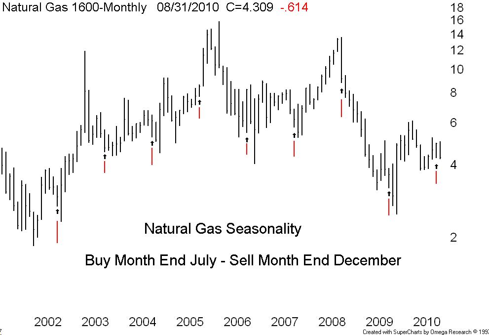
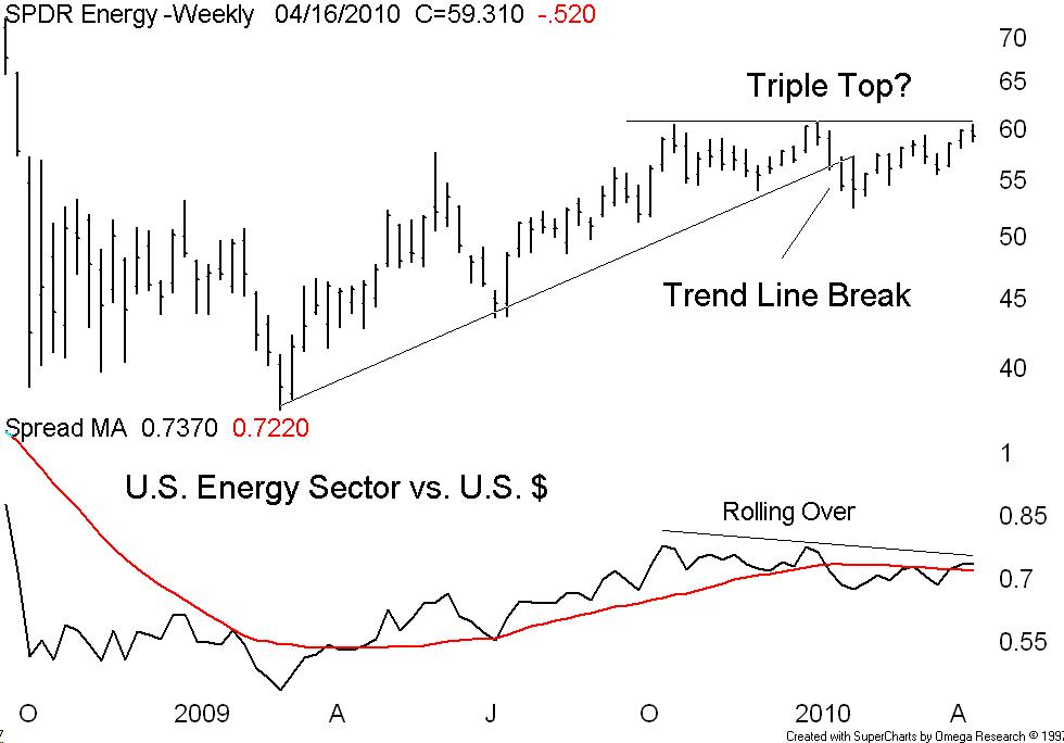
The real technical problem (too bad Rosenberg never gave me a call) is the price of crude pushing above $80. Note the long term monthly chart of the Dow Industrials plotted above the price of crude and note the modern trading range of crude the North American markets can tolerate because of peaking crude consumption due to alternate sources and more fuel efficient autos combined with muted long term growth prospects. Forget 1929 – right now the last thing we need is another 1973 style energy price shock