I can always spot a novice technical analyst when I look at a few of their charts. Some common errors are the use of incorrect scaling, the excessive use of squiggly lines, the excessive use of daily charts, the reliance on free internet charts from Big Charts or Stockcharts and the inability to spot divergence.
The scaling error is the easy error to spot so here is the rule: If the data in the window doubles use a semi-log scale. I do note the Market Technicians Association (MTA) recommend switching to a semi-log scale if the data exceeds 30% of the price range.
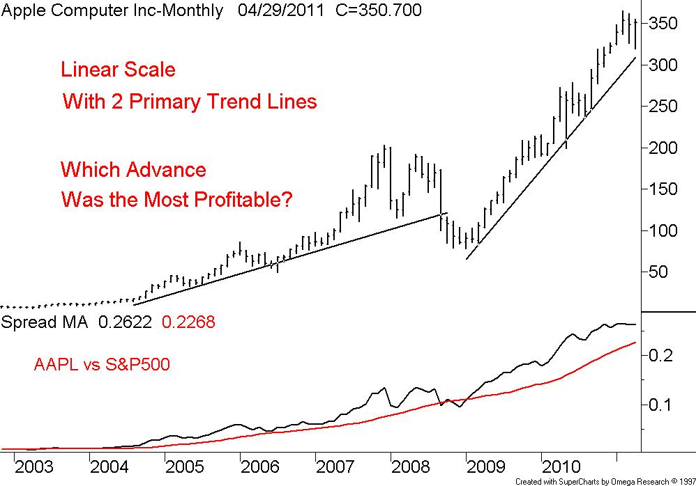
There are two big problems associated with the use of a linear scale in long term technical analysis. First is you cannot properly place trend lines on a linear scale chart and second, in a long advance it appears most of the gains are recent. In other words the newer investors are making more money that the older investors. This creates a false sense of urgency to jump in now because the advance appears youthful.
Note our first chart of Apple Inc., monthly data spanning about 10-years using a linear scale. I have placed two primary trend lines that split the two great advances of 2004 to 2008 and then from 2009 to date. So which advance made the most money?
Note our second chart of Apple Inc., monthly data spanning about 10-years using a semi-log or percent scale. I am now able to properly fit one primary trend line that still splits the two great advances of 2004 to 2008 and then from 2009 to date. So which advance made the most money?


1 comment:
Nice post, Bill. To put a twist on your argument, I wrote the following blog post (and many others) last summer discussing the bullish divergence in transportation and small cap stocks related to the senior indices. http://ibankcoin.com/chessnwine/2010/07/23/trannie-lover-deluxe/
Post a Comment