Why
do you always use a semi-log scale in your charts? This is a question I always
get during a teaching session. Usually the students are industry pros who surprisingly
are not clear on the choice between a linear or semi-log (percent) scale.
The
old rule among technical analysts used to be if the data doubles use a semi-log
scale but now many will use a 50% price range before the switch from linear to
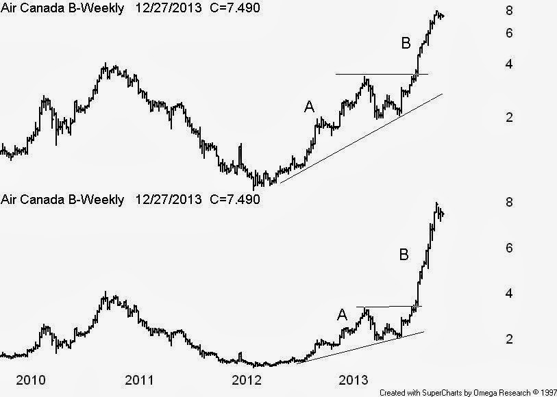
semi-log. I always use a semi-log - see the Air Canada chart example.
On
the lower linear scale it appears the advance at B is greater than the advance
at A which is not true. The above semi log clearly displays the A & B
advances to be about equal in price change. Also never draw trend lines on a
linear scale. This is a common error even among CMT’s that should know better.


 Posts
Posts

